The {geofacet} extension provide a facet_geo() function which allows to position plots in a similar pattern to the original geography. The amount of information given by the whole plot is thus more important than on classical chloropleths, where the different entities of the map are colored according to a single variable. But such plots are harder to read and less accessible than chloropleths.
In this tutorial, we will see how we can mix both approaches, and add a “classic” chloropleth map to the plots produced with {geofacet}. As an example, we will use the TidyTuesday dataset about milk production in the US
1. Time series map with {geofacet}
This dataset contains a table listing milk production by state from 1970 to 2017.
library(tidyverse)
# Load data
production<-read_csv('https://raw.githubusercontent.com/rfordatascience/tidytuesday/master/data/2019/2019-01-29/state_milk_production.csv')

head(production)
## # A tibble: 6 x 4
## region state year milk_produced
## <chr> <chr> <dbl> <dbl>
## 1 Northeast Maine 1970 619000000
## 2 Northeast New Hampshire 1970 356000000
## 3 Northeast Vermont 1970 1970000000
## 4 Northeast Massachusetts 1970 658000000
## 5 Northeast Rhode Island 1970 75000000
## 6 Northeast Connecticut 1970 661000000In this table, milk production is given in pounds. We will make a quick conversion to liters.
# 100 pounds of milk ~ 44 liters
production <- production %>%
  mutate(milk_liter=milk_produced*(44/100))
We will start with a combined graph with facet_wrap(), showing the temporal evolution of the milk production in each state.
ggplot(
  data=production,
  aes(x=year,y=milk_liter/10^9))+
  geom_line()+
  # One plot by state
  facet_wrap(~state)+
  scale_x_continuous(breaks=c(1970,1986,2002))+
  scale_y_continuous(breaks=c(0,7,14))+
  labs(
    y="Milk production (billion liters)",
    x="")+
  theme_minimal()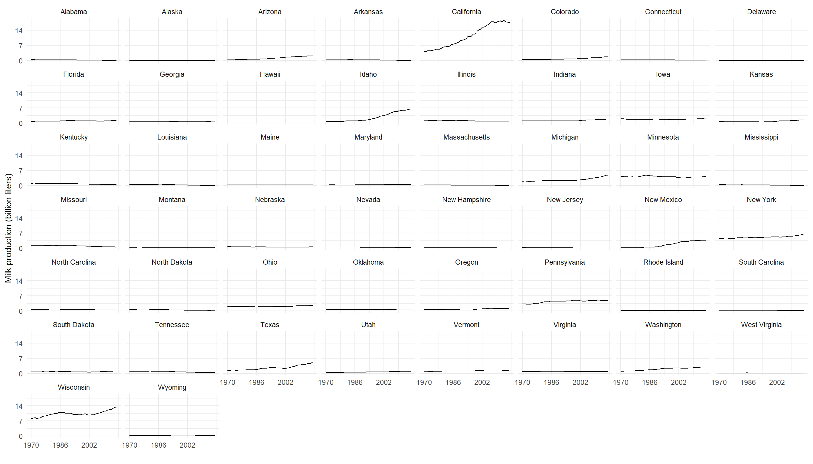
In the plot above, the states are arranged in alphabetical order, not by geographical location. After loading the {geofacet} extension, we just have to change facet_wrap() to facet_geo() to convert this plot into a map.
library(geofacet)

ggplot(
  data=production,
  aes(x=year,y=milk_liter/10^9))+
  geom_line()+
  # One plot by state
  facet_geo(~state)+
  scale_x_continuous(breaks=c(1970,1986,2002))+
  scale_y_continuous(breaks=c(0,7,14))+
  labs(
    y="Milk production (billion liters)",
    x="")+
  theme_minimal()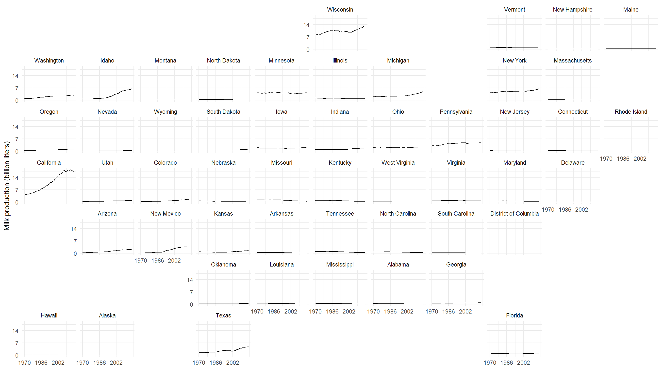
Looking closely at the graph above, we can see that no data is available for the District of Columbia in our data set. To remove this state from our plot, we will simply change the reference grid. The use of the predefined grids in geofacet is quite straightforward, and many grids are avaible for various countries.
library(geofacet)

ggplot(
  data=production,
  aes(x=year,y=milk_liter/10^9))+
  geom_line()+
  # Reference grid without DC
  facet_geo(~state, grid = "us_state_without_DC_grid3")+
  scale_x_continuous(breaks=c(1970,1986,2002))+
  scale_y_continuous(breaks=c(0,7,14))+
  labs(
    y="Milk production (billion liters)",
    x="")+
  theme_minimal()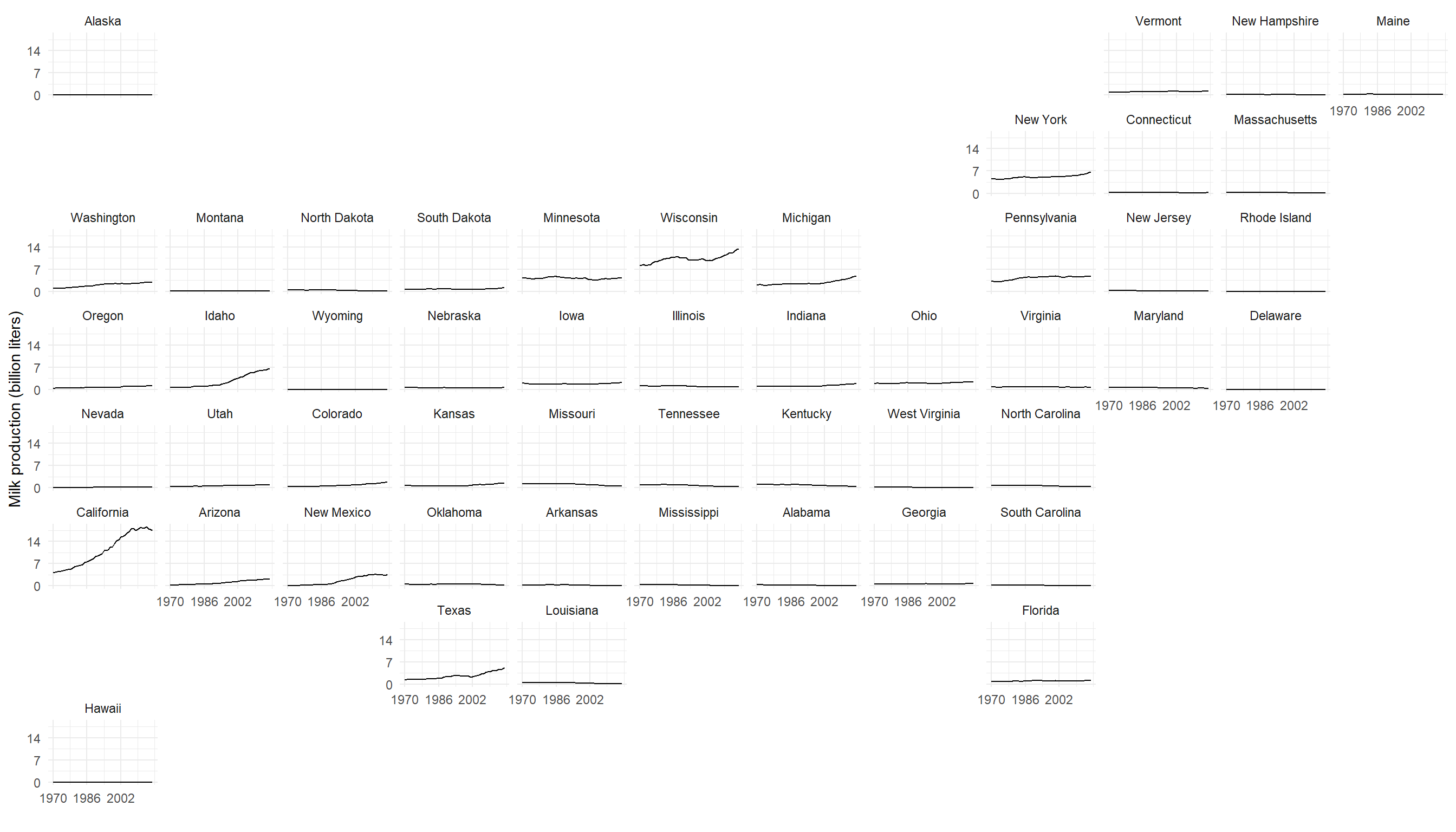
2. Adding chloropleth
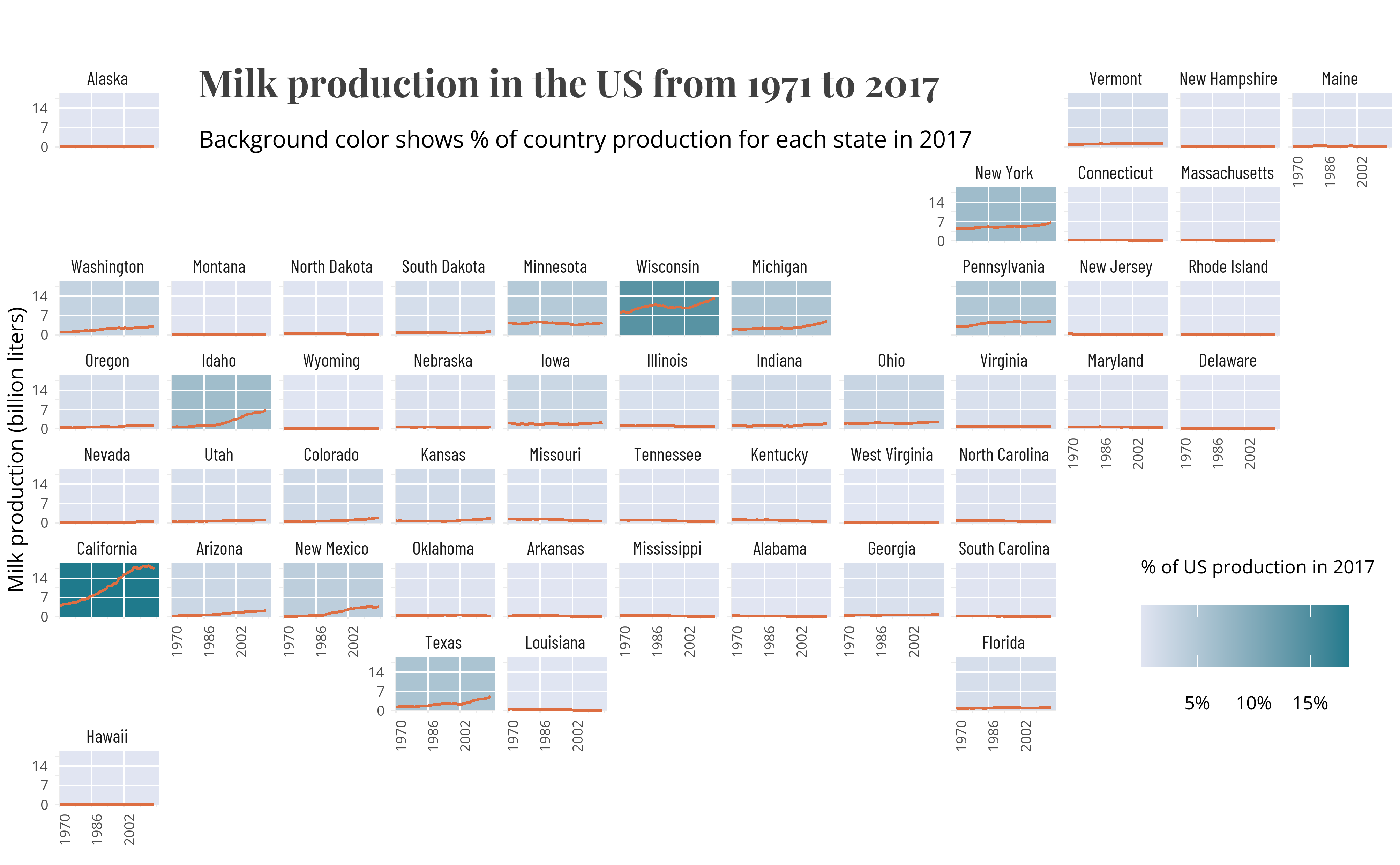
The resulting graph may be difficult to read, due to the amount of information available. To make it easier to read, we will color each state according to the amount of milk produced relative to the country’s total production in 2017, in a similar way to chloropleths.
To do so, we will start by calculating this ratio for each state.
# Compute percentage produced by each state and by year
production<-production%>%
  dplyr::group_by(year)%>%
  dplyr::mutate(tot=sum(milk_liter))%>%
  ungroup()%>%
  mutate(per=milk_liter/tot*100)
We are now ready to add this information on the map with geom_rect().
chloropleth<- ggplot(
  production, aes(x=year,y=milk_liter/10^9))+
  # Place geom_rect() before geom_line()
  geom_rect(
    # Select only 2017
    data=production%>%filter(year==2017),
    # Fill according to percentage
    aes(fill=per),xmin=1970,xmax=Inf,ymin=0,ymax=Inf,
    inherit.aes = FALSE)+
  scale_fill_gradient(low="#e1e5f2",high="#1f7a8c")+
  geom_line(color="#d1495b")+
  scale_x_continuous(breaks=c(1970,1986,2002))+
  scale_y_continuous(breaks=c(0,7,14))+
  labs(
    y="Milk production (billion liters)",
    x="",
    fill="% of country\nproduction (2017)")+
  facet_geo(~state, grid = "us_state_without_DC_grid3")+
  theme_minimal()

chloropleth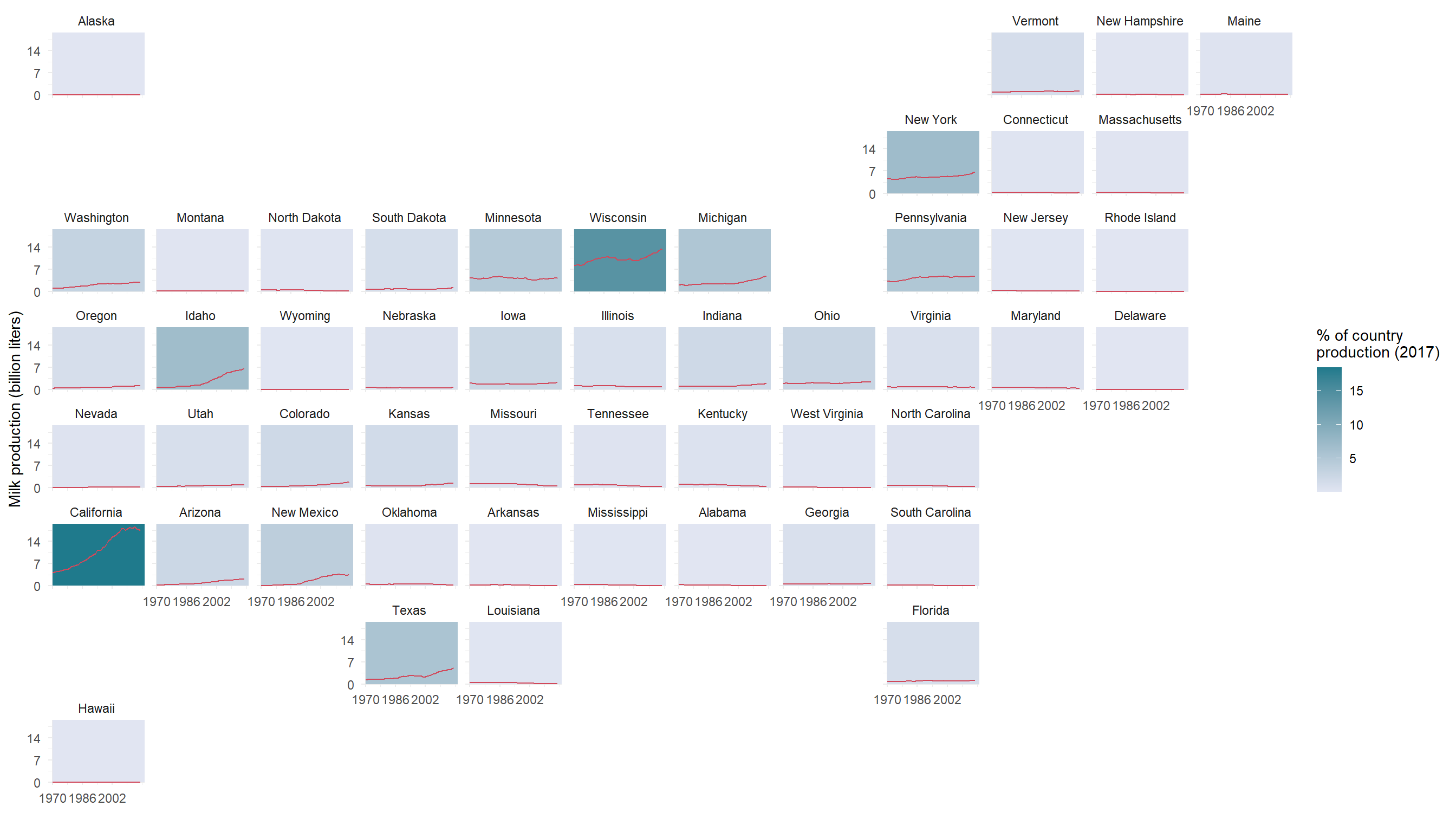
So California is clearly visible as the main milk producer in the US, which may be surprising given the state’s rather dry climate, which can limit the production of forage resources.
To finish the layout of the graph, we can manually add the grid of graphs, which has been covered by geom_rect().
# Grid coordinates
grid <- tibble(
  x=c(1986,2002),
  y=c(7,14)
)

chloropleth+
  # Add grid to plot
  geom_segment(
    data=grid,aes(x=x,xend=x),y=0,yend=Inf,color="white"
  )+
  geom_segment(
    data=grid,aes(y=y,yend=y),x=0,xend=Inf,color="white"
  )
3. Customize plot
You may now customize the plot! You will find below an example (full code available here).