Text customization is an important step in the creation of a graph. In this post, we will see how we can change text fonts with {showtext} and add more changes with {ggtext}. We will then apply this to a graph created in a previous post: the introduction to {ggplot2} with the evolution of nitrogen use efficiency.
1. Change fonts with {showtext}
With {showtext} extension, you can use fonts from the Google fonts library (https://fonts.google.com/).
You can start by exploring this webpage to find a font that suits you. Playfair Display is a font that I often use in my plots. If you want more than one font (for example, one for the title, one for the rest of the plot), Google fonts has a “Pairings” tab, which shows the most popular pairings with a specific font. Here, we will use Nunito in addition to Playfair Display.
We are now ready to load the selected fonts into R with font_add_google().
# Load {showtext}
library(showtext)

# Add Google fonts
font_add_google(
  name = "Playfair Display",  # Name in fonts.google.com
  family = "playfair"         # Name in your R session
)
font_add_google("Nunito", "nunito")

# Automatically use {showtext} for plots
showtext_auto()
Unlike {extrafont}, {showtext} allows you to use the fonts without installing them on your computer. The above steps must therefore be repeated for each new session.
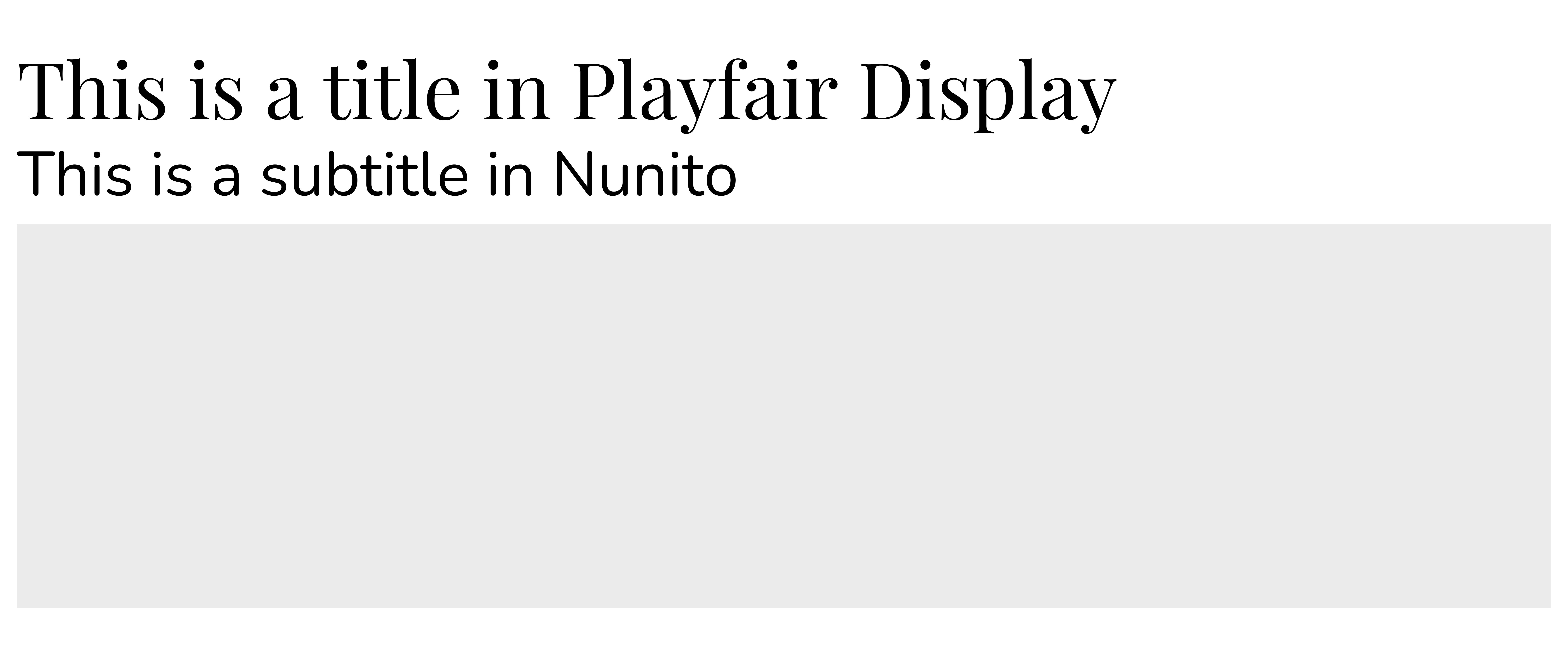
We may now use these new fonts in plots. With {ggplot2}, you can select font in theme(), with the family argument.
# Load {ggplot2} (inside {tidyverse})
library(tidyverse)

# Make plot
ggplot()+
  labs(
    title="This is a title in Playfair Display",
    subtitle ="This is a subtitle in Nunito")+
  coord_fixed(0.25)+
  theme(
    # Select title font
    plot.title = element_text(family="playfair",size=25),
    # Select subtitle font
    plot.subtitle = element_text(family="nunito",size=20)
  )
2. Multiple fonts in one text with {ggtext}
With the {ggtext} extension, you can use HTML tags and CSS properties to add more customizations to your text.
Without going into the details of HTML and CSS, we will see an example of the use of i and b tags to change a text from italic to bold, and font-family and color properties to specify text fonts and colors. We will start by creating a table with title and subtitle labels written with HTML syntax.
# Load extensions
library(ggtext)
library(glue)

# Table with labels with HTML syntax
data <- tibble(
  text = c("Playfair Display","Nunito"),
  family = c("playfair","nunito")
  )%>%
  mutate(
    title = glue("<i>This is a text in</i> <b style='font-family: {family}; color: red'>{text}</b> ")
  )

# Show title with HTML syntax
data$title[1]
## <i>This is a text in</i> <b style='font-family: playfair; color: red'>Playfair Display</b>To use these labels in one ggplot(), in the theme(), we have to change element_text() to element_markdown().
ggplot()+
  labs(
    title=data$title[1],
    subtitle =data$title[2]
  )+
  coord_fixed(0.25)+
  theme(
    # Specify element_markdown()
    plot.title = element_markdown(size=30),
    plot.subtitle = element_markdown(size=25)
  )
3. Example with one plot
To finish, we are going to illustrate the possibilities of text customization by editing graph made in a previous post: the introduction to {ggplot2} with the evolution of nitrogen use efficiency.
Data preparation is as follows:
# Import data (only table of interest: yield and fertilizer)
fertilizer <- readr::read_csv('https://raw.githubusercontent.com/rfordatascience/tidytuesday/master/data/2020/2020-09-01/cereal_crop_yield_vs_fertilizer_application.csv')

# Vector for country selection
countries <- c(
  "France","United States","Brazil",
  "China","India","Australia"
)

# Data cleaning and preparation
ferti_clean<-fertilizer%>%
  filter(complete.cases(.))%>%
  rename(
    Yield = 'Cereal yield (tonnes per hectare)',
    Nitrogen = 'Nitrogen fertilizer use (kilograms per hectare)'
  )%>%
  filter(Entity%in%countries)%>%
  mutate(Entity=case_when(
    Entity=="United States"~"USA",
    TRUE~Entity
  ))%>%
  mutate(
    Efficiency = Yield/Nitrogen
  )
We will now load additional fonts for this plot.
# Load additional fonts
font_add_google("Open Sans", "open")
font_add_google("Oswald", "oswald")
font_add_google("Cabin", "cabin")
font_add_google("Acme", "acme")
Finally we can produce our new plot.
example <- ggplot(
  data=ferti_clean,
  aes(x=fct_reorder(Entity,-Efficiency),y=Efficiency))+
  geom_boxplot(outlier.shape = NA)+
  geom_jitter(aes(color=Year), size=1.5)+
  scale_color_gradient(low = "#a9d6e5", high = "#012a4a")+
  scale_y_continuous(breaks=c(0.03,0.06,0.09,0.12))+
  labs(
    title="<span>Comparison of Nitrogen Use Efficiency</span> <span style='color: grey'>(NUE)</span>",
    subtitle="<span>Each dot represents one year,  from </span><b style='color: #a9d6e5'> 2002 </b><span> to </span><b style='color: #012a4a'> 2017 </b>",
    caption="<b>Data: </b><span> Our World in Data </span>",
    x="",
    y="<span style='color: #2F4F4F'>NUE</span><br><span style='color: grey'>(t of cereals per kgN)</span>"
  )+
  guides(color=FALSE)+
  theme_minimal()+
  theme(
    plot.title = element_markdown(family="oswald",size=20),
    plot.subtitle = element_markdown(family = "cabin",size=15),
    axis.text.x = element_text(family="acme",size=13,angle=45,hjust=1, color='#2F4F4F'),
    axis.text.y = element_text(family="open",size=11,angle=90,hjust=0.5, color='#2F4F4F'),
    axis.title.x = element_text(family="cabin",size=13),
    axis.title.y = element_markdown(family="cabin",size=13),
    plot.caption = element_markdown(family="open", size=10)
  )

example
References
- Yixuan Qiu, showtext: Using Fonts More Easily in R Graphs
- Claus Wilke, ggtext: Improved text rendering support for ggplot2