The {ggplot2} extension, developed by Hadley Wickham, is a powerful tool for making plots with R.
We will see here how to use this extension to compare nitrogen fertilizer use efficiencies between different countries of the world.
1. Getting started
1.1. Load extension(s)
There are two ways to load {ggplot2} in R: either by loading the extension alone, or by loading the {tidyverse}, which is a collection of extensions designed to work together and based on a common philosophy, making data manipulation and plotting easier.
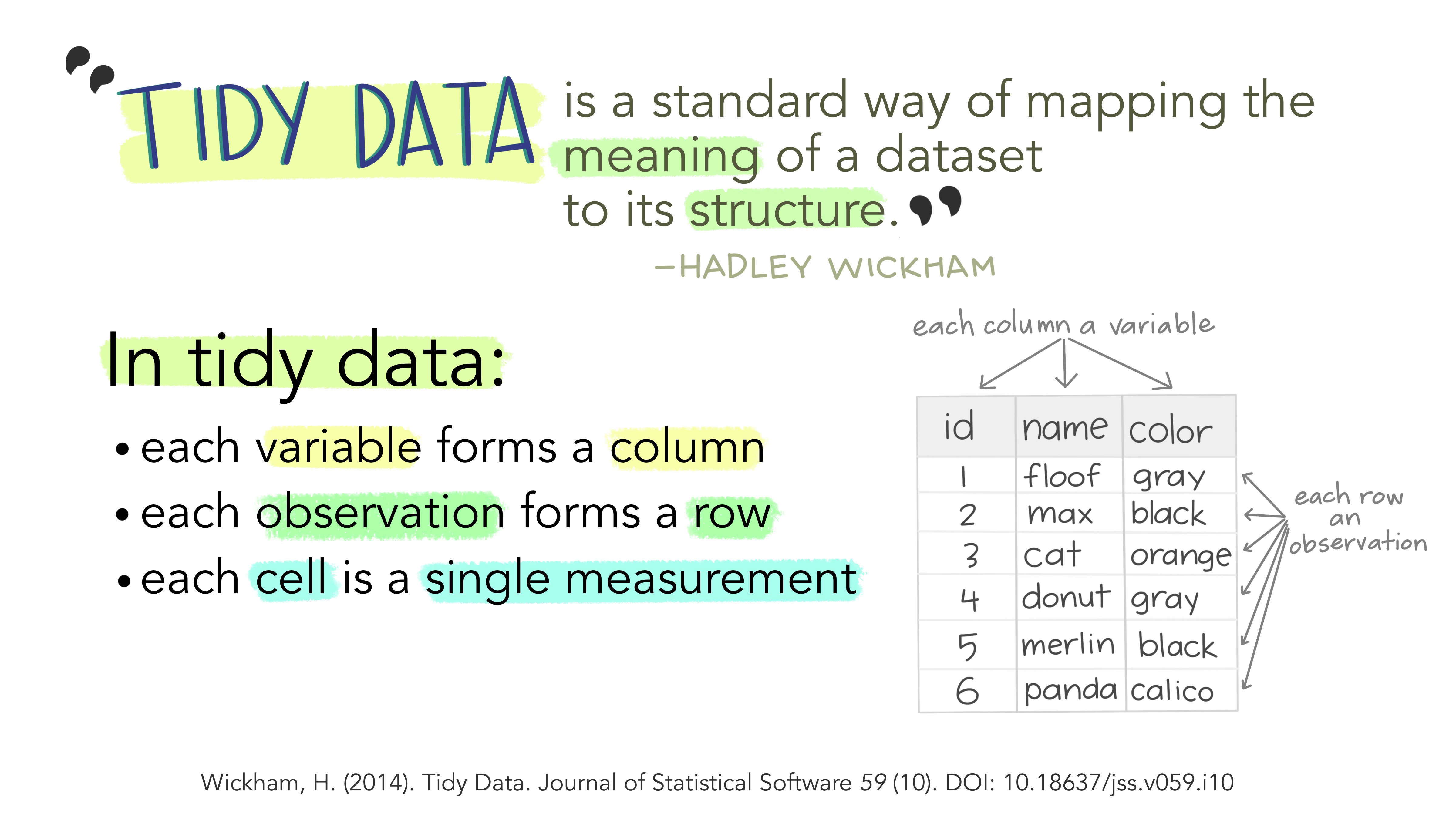
Figure 1 The “tidy” philosophy (Image credit: Allison Horst)
Keep in my mind this data structure, it will be useful later to understand how {ggplot2} works.
We are going to load the whole {tidyverse} to be able to use some useful commands for data manipulation, even if this tutorial will focus later on how to make plots. You can also look at this tutorial if you want more details on data manipulation with the {tidyverse}.
If it is the first time that you use the {tidyverse} extension, you need to install it first using install.packages(“tidyverse”). Then, you may load it in your R session using library(tidyverse). You only need to install extensions once, but you need to load them at each session.
# Install tidyverse (to do once)
# install.packages("tidyverse")
# Load tidyverse (to repeat at each session)
library(tidyverse)
1.2. Import data
Now that we have loaded the necessary extensions, we will load the dataset: cereal yields and nitrogen fertilizer consumption by country. The data we are going to use come from Our World in Data, which compiles data from various sources including the FAO.
This dataset was previously used in TidyTuesday, a weekly data project aimed at the R ecosystem. Each week, a new dataset is made available, allowing users to develop their skills and understand how to summarize and arrange data to make meaningful charts with tools in the {tidyverse}.
This makes the data easy to load into R. As for the {tidyverse}, if you never used the TidyTuesday package, you need to install it first with install.packages(“tidytuesdayR”). You may then load the dataset of interest like this:
# Install tidytuesdayR extension (to do once)
# install.packages("tidytuesdayR")
# Import data (only table of interest: yield and fertilizer)
fertilizer <- readr::read_csv('https://raw.githubusercontent.com/rfordatascience/tidytuesday/master/data/2020/2020-09-01/cereal_crop_yield_vs_fertilizer_application.csv')
head(fertilizer)
## # A tibble: 6 x 5
## Entity Code Year `Cereal yield (tonnes p~ `Nitrogen fertilizer use (kilo~
## <chr> <chr> <dbl> <dbl> <dbl>
## 1 Afghanis~ AFG 1961 1.12 NA
## 2 Afghanis~ AFG 1962 1.08 NA
## 3 Afghanis~ AFG 1963 0.986 NA
## 4 Afghanis~ AFG 1964 1.08 NA
## 5 Afghanis~ AFG 1965 1.10 NA
## 6 Afghanis~ AFG 1966 1.01 NAIf we look at the first lines of the table, we can see that there is a difference between the yield data, which are available from 1961, and the use of nitrogen fertilizers, which is only available from 2002. To be able to compute nitrogen use efficiencies, we will keep only the lines with all available data using the {tidyverse} syntax. We will also shorten the cereal yield and nitrogen fertilizer use columns, so they will be easier to use later.
# Data cleaning:
ferti_clean<-fertilizer%>%
  filter(complete.cases(.))%>%
  rename(
    Yield = 'Cereal yield (tonnes per hectare)',
    Nitrogen = 'Nitrogen fertilizer use (kilograms per hectare)'
  )
head(ferti_clean)
## # A tibble: 6 x 5
## Entity Code Year Yield Nitrogen
## <chr> <chr> <dbl> <dbl> <dbl>
## 1 Afghanistan AFG 2002 1.67 3.16
## 2 Afghanistan AFG 2003 1.46 2.58
## 3 Afghanistan AFG 2004 1.33 2.82
## 4 Afghanistan AFG 2005 1.79 2.59
## 5 Afghanistan AFG 2006 1.55 2.59
## 6 Afghanistan AFG 2007 1.92 2.07Additional information about the dataset (definition of variables, units…) are available here.
2. Plotting the data
Now that the dataset is “clean”, we may produce our first plot.
2.1. Starting with ggplot()
We will start with the average data for the whole world.
# Select data for "World" only
world<-ferti_clean%>%
  filter(Entity=="World")
To create a graph with {ggplot2}, we always start with the ggplot() function. Within this function, we will specify the dataset we want to use (with data) and aesthetic mapping (with aes()). If we want to plot the evolution of yield, we may start with the following code:
# Create plot
first<-ggplot(
  data=world,            # Dataset
  aes(x=Year,y=Yield)    # x/y axis
)
# Call plot
first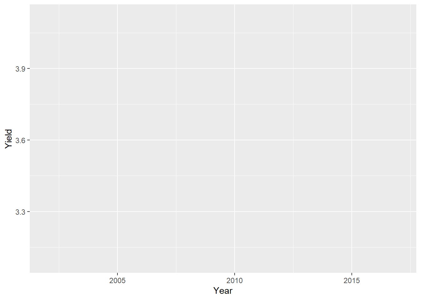
For now, we have an empty plot because we did not yet specify the type of plot we wanted. This is done by adding a new layer with the + operator. Functions that specify the type of data representation start with geom_. For instance, to add points on the plot, we use geom_point:
first<-first+
  geom_point()

first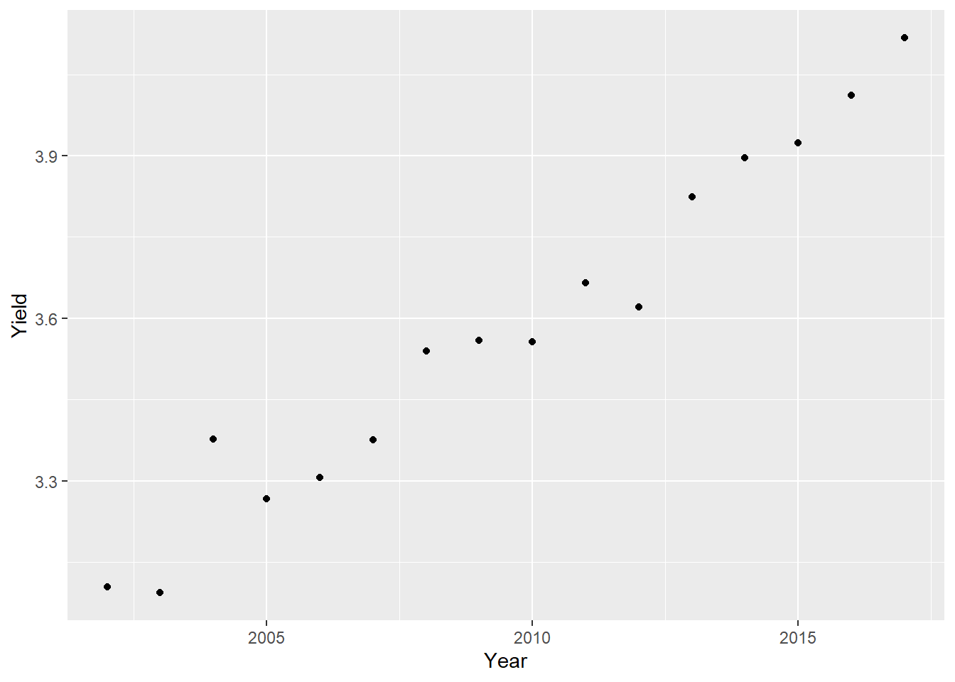
To produce this plot, {ggplot2} follows the structure of the tidyverse data given in figure 1: each line of the input table corresponds to one point one the plot. It is important to follow this data structure to use {ggplot2}.
Note that you may also specify the data and aes() directly in the geom_ function. The following code will produce the same plot as before:
first_other<-ggplot()+
  geom_point(
    data=world,
    aes(x=Year,y=Yield)
  )
You may have several geom_ layers for the same plot. Here, we will add a red line that connects the dots with geom_line(). {ggplot2} is sensitive to the order in which the layers are added (last layer added is superimposed on the previous layers). To make sure that the points are always visible behind the new line, we will add some transparency with the alpha parameter.
first<-first+
  geom_line(
    color="red",     # Line color
    size=2,          # Line size
    alpha=0.1        # Add transparency (1=solid,0=transparent)
  )

first
Some parameters are available for almost all geom_ functions (color, size…) while some are specific of a given geom_. For example, if we want to add a regression line to our graph with geom_smooth, we can specify that we want a linear regression with the method argument (default is Loess regression).
first<-first+
  geom_smooth(
    col="red",        # Color argument OUTSIDE aes()
    method="lm",      # Method for smoothing
    size=0.5,
    lty="dashed",     # Linetype
    se=FALSE          # Hide standard error
  )
first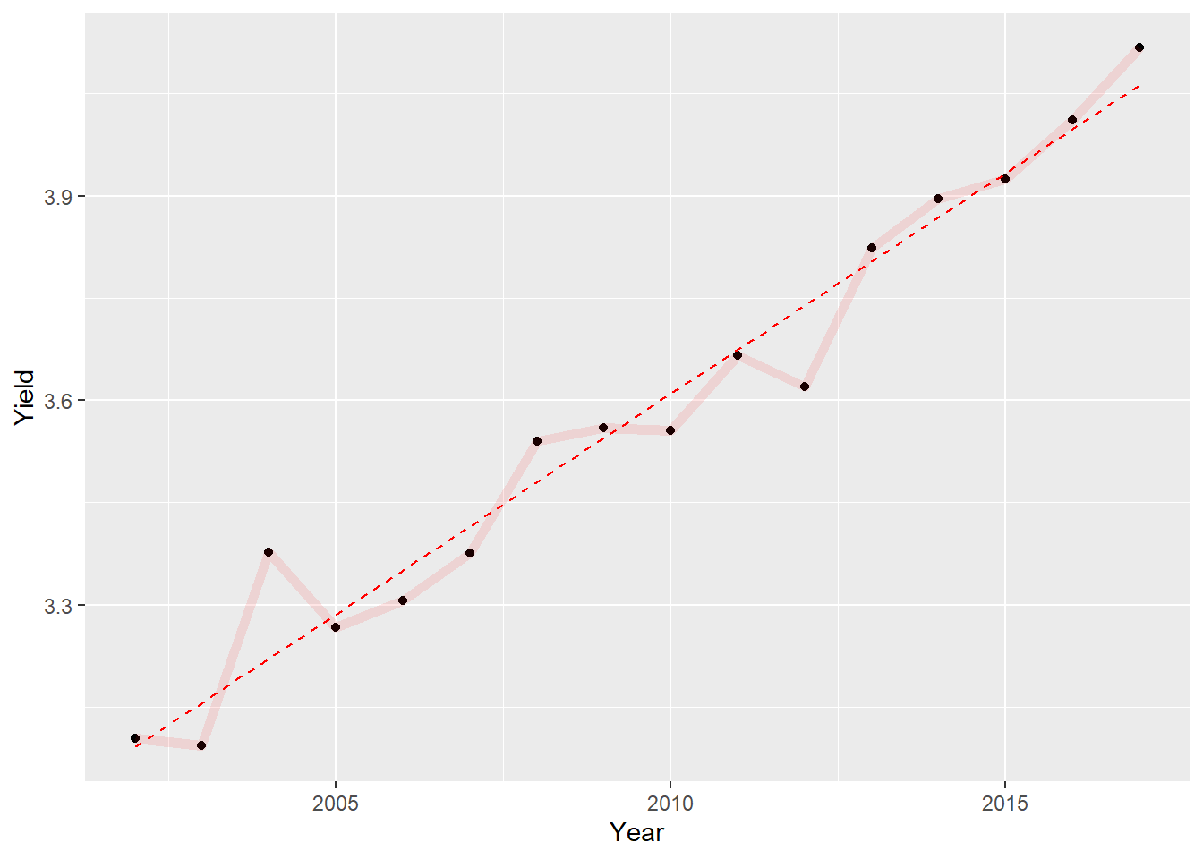
We may use labs() to specify important text information on our plot. Besides axis names, labs() allows to specify three different kind of texts: title, subtitle and caption (usually used for data source or author name).
first<-first+
  labs(
    title="Evolution of world cereal yield from 2002 to 2017",
    subtitle="Solid line shows average yields and dashed line the global trend",
    caption="Source: Our World in Data",
    x="Year",
    y="Yield (t.ha-1)"
  )

first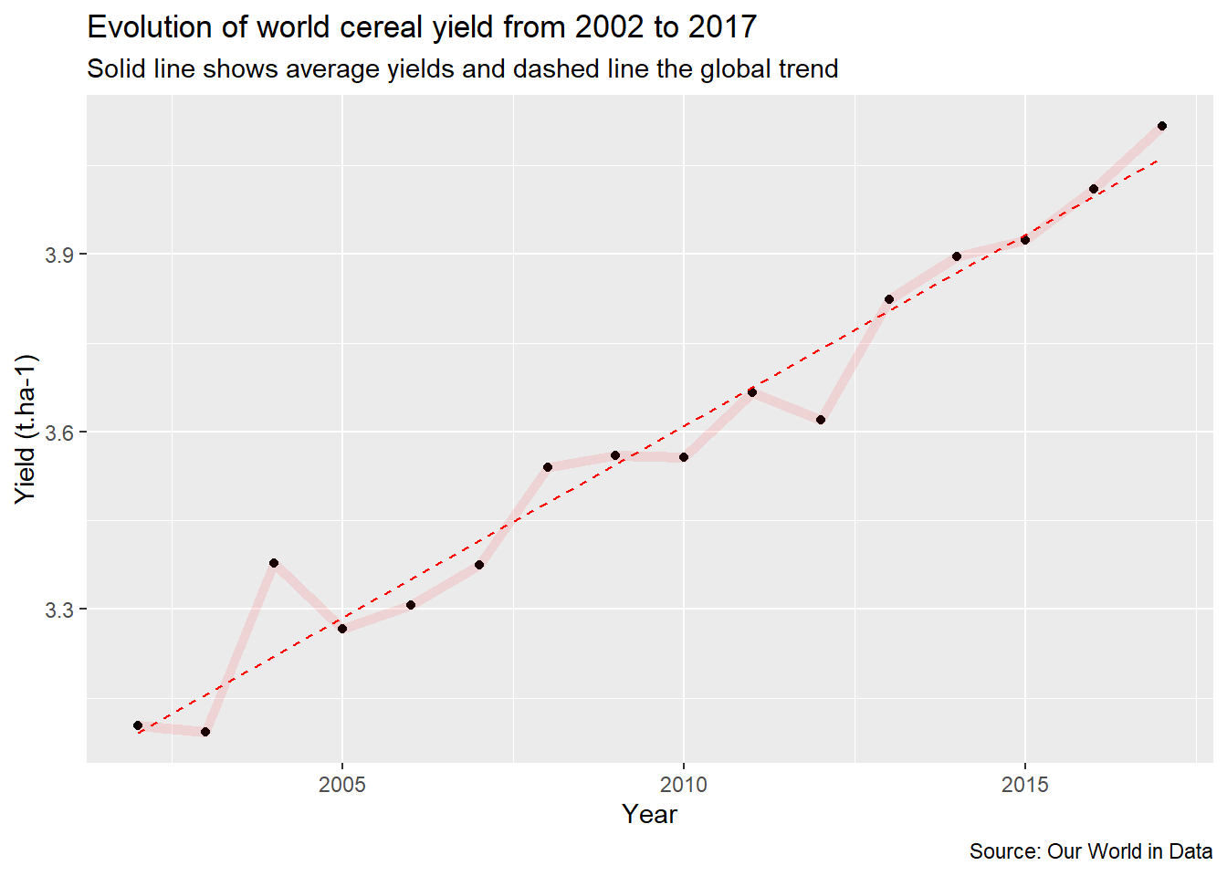
This graph shows a clear trend of increasing yields in recent years.
To finish with this first example, we will now modify the aesthetics of the graph. For this we will use one of the predefined themes of {ggplot2} : theme_light().
first<-first+
  theme_light()
There are several standard themes that can be used for {ggplot2}. There are also many, many, many additional customization possibilities that can be done manually within the theme() function. If you want to go further on {ggplot2} customization, this post from Cedric Scherer is an excellent guide to explore these possibilities. However, a time-saving tip is to start by choosing the general theme that most closely approximates the desired final rendering, to limit the changes needed later.
2.2. Learning to use the aes()
How has nitrogen fertilizer use efficiency changed with increasing yields? This is what we will investigate with our second plot, showing how we can use the aes() argument to add information on the plot.
As nitrogen use efficiency may be computed as the amount of cereals produced by unit of fertilizer used, let’s start by showing the evolution of yields as a function of nitrogen fertilizer consumption:
ggplot(
    data=world,
    aes(x=Nitrogen,y=Yield)
  )+
  geom_point()+
  theme_light()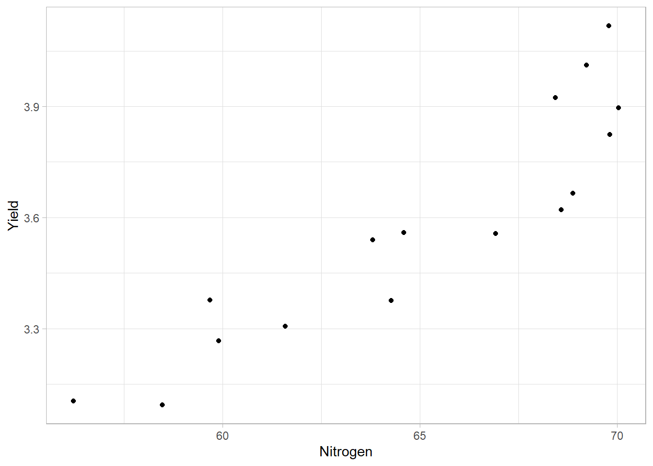
The problem with this plot is that we don’t know which point corresponds to which year. We can add this information with a different color per year, using the aes() of ggplot() or geom_point() directly.
second<-ggplot(
    data=world,
    aes(x=Nitrogen,y=Yield)
  )+
  geom_point(
    aes(color=Year)          # Specify the color argument INSIDE aes()
  )+
  theme_light()

second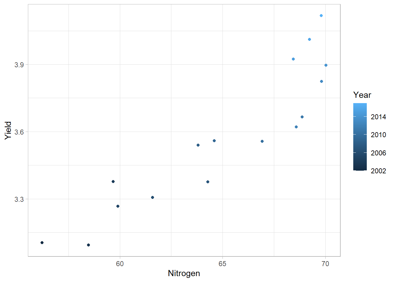
Again, it is important to follow the data structure given in Figure 1 (one row equals one observation and each column equals a variable) to be able to associate the right color to each observation (each year here).
As for the first plot, we may add some texts to our plot:
second<-second+
  labs(
    title="Evolution of nitrogen use efficiency from 2002 to 2017",
    subtitle="Clearer dots shows more recent years",
    caption="Source: Our World in Data",
    x="Nitrogen use (kg.ha-1)",
    y="Yield (t.ha-1)",
    color="Time scale"         # Change color legend title
  )

second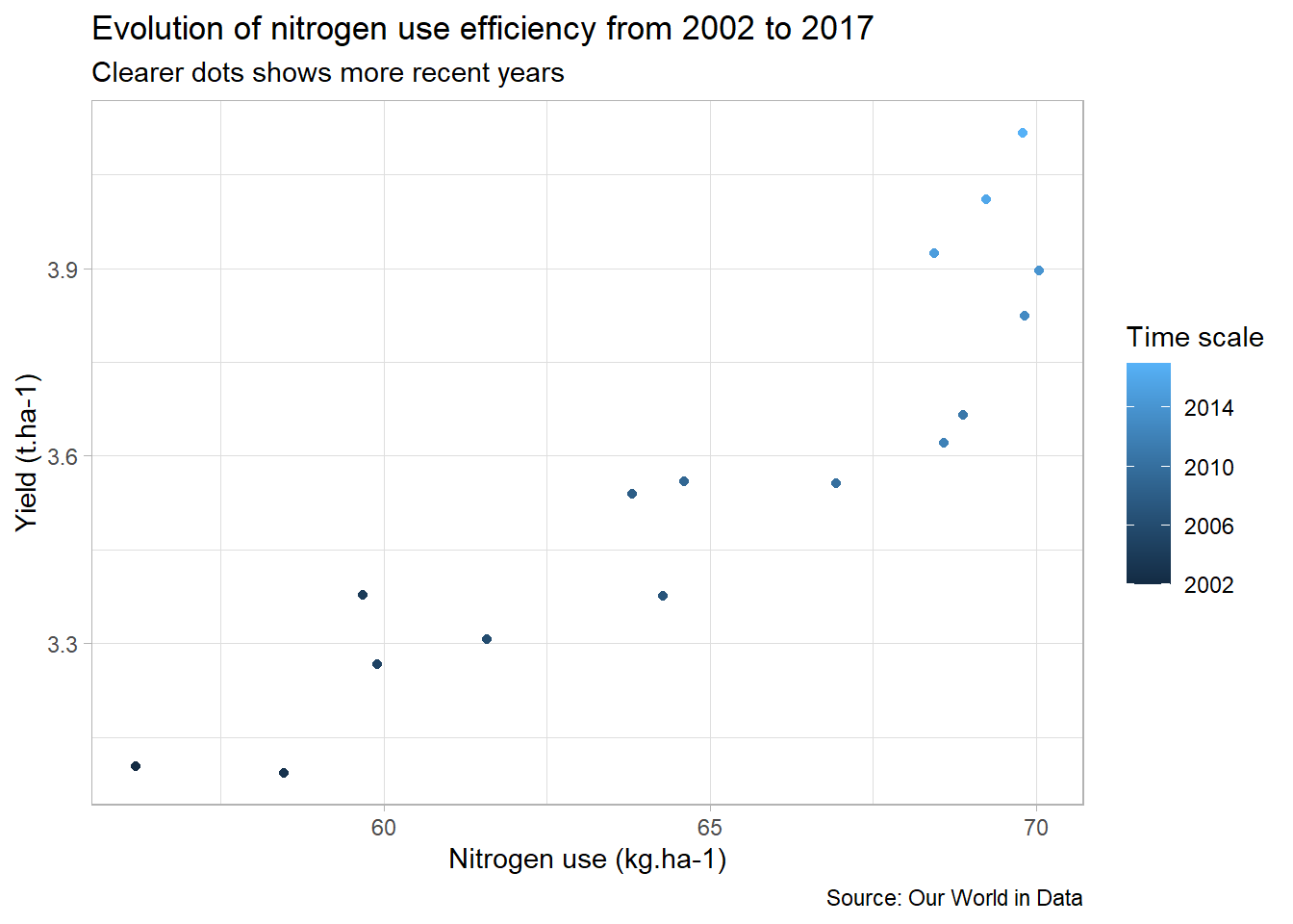
To be clearer, we can add some text on the plot with geom_text() to labels some years:
second<-second+
  geom_text(
    data=filter(world,Year=="2002"|Year=="2017"), # Keep only extrem years
    aes(
      label=Year,          # Specify text
      color=Year),         # Specify color
    nudge_y = 0.1)         # To avoid overlapping with points

second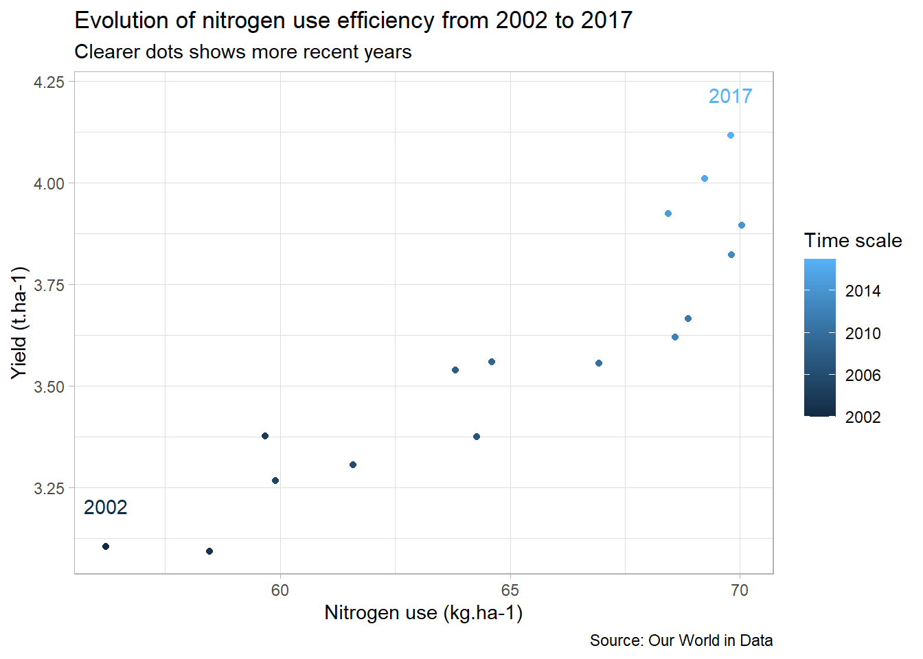
We already have an overview of the evolution of the nitrogen use efficiency since 2002, but the information can’t be read directly on the plot. To make the plot more meaningful, we will create a new efficiency column in our data table, which we will then compare to the 2002 efficiency to see if the efficiency is increasing or decreasing.
world_eff <- world%>%
  mutate(
    Efficiency = Yield/Nitrogen             # New column with efficiency for each year
  )

world_eff_2002 <- world_eff%>%
  filter(Year=="2002")%>%                   # Select year 2002
  pull(Efficiency)                          # Extract efficiency value

world_eff<-world_eff%>%
  mutate(                                   # New column with "relative" efficiency
    Eff_relative = case_when(
      Efficiency==world_eff_2002~"Stable",
      Efficiency<world_eff_2002~"Decrease",
      TRUE~"Increase"
    )
  )

head(world_eff)
## # A tibble: 6 x 7
## Entity Code Year Yield Nitrogen Efficiency Eff_relative
## <chr> <chr> <dbl> <dbl> <dbl> <dbl> <chr>
## 1 World OWID_WRL 2002 3.10 56.2 0.0552 Stable
## 2 World OWID_WRL 2003 3.09 58.5 0.0529 Decrease
## 3 World OWID_WRL 2004 3.38 59.7 0.0566 Increase
## 4 World OWID_WRL 2005 3.27 59.9 0.0545 Decrease
## 5 World OWID_WRL 2006 3.31 61.6 0.0537 Decrease
## 6 World OWID_WRL 2007 3.38 64.3 0.0525 DecreaseWe can now show this new information about the relative nitrogen use efficiency compared to 2002 directly on the plot:
second_bis <- ggplot(
    data=world_eff,
    aes(x=Nitrogen,y=Yield)
  )+
  geom_text(
    aes(label=Year,color=Eff_relative)  # To plot directly text instead of points
  )+
  theme_light()

second_bis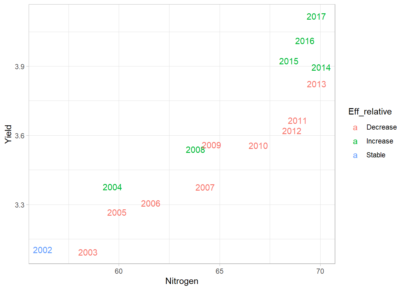
To finish this plot, let’s do a bit of customization:
second_bis <- second_bis+
  scale_color_manual(
    values=c("tomato","forestgreen","black")    # Change colors
  )+
  guides(
    color=FALSE                                 # Hide color legend
  )+
  labs(
    title="Evolution of nitrogen use efficiency from 2002 to 2017",
    subtitle="Red: years with lower efficiency than 2002 (Green: higher efficiency)",
    caption="Source: Our World in Data",
    x="Nitrogen use (kg.ha-1)",
    y="Yield (t.ha-1)"
  )

second_bis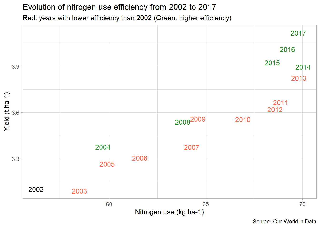
We now have a plot that clearly shows us that nitrogen use efficiency tended to decrease until 2014, and then to increase until 2017. Moreover, on the same plot world cereal yields increase from 2002 to 2017.
3. Going further
Now that we have seen the general trend, we can wonder what are the differences in efficiency between countries?
3.1. Comparison between countries
To do this, let’s first select a bunch of countries, then calculate the nutrient use efficiency for each year and each country (see above).
countries <- c(
  "France","United States","Brazil",
  "China","India","Australia"
)

selection<-ferti_clean%>%
  filter(Entity%in%countries)%>%
  mutate(
    Efficiency = Yield/Nitrogen             # New column with efficiency for each year
  )

head(selection)
## # A tibble: 6 x 6
## Entity Code Year Yield Nitrogen Efficiency
## <chr> <chr> <dbl> <dbl> <dbl> <dbl>
## 1 Australia AUS 2002 2.20 40.7 0.0539
## 2 Australia AUS 2003 1.02 39.6 0.0258
## 3 Australia AUS 2004 2.12 40.5 0.0523
## 4 Australia AUS 2005 1.69 35.6 0.0476
## 5 Australia AUS 2006 2.11 34.9 0.0605
## 6 Australia AUS 2007 0.981 36.1 0.0272Then, we can then use geom_boxplot() to compare the nitrogen use efficiency between countries:
third <- ggplot(
  data=selection,
  aes(x=Entity,y=Efficiency))+
  geom_boxplot(
    outlier.shape = NA            # Hide outliers
  )+
  theme_light()

third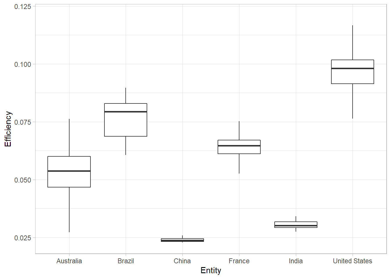
When we have a limited number of points, it is useful to represent them directly on the graph to show directly the data distribution. To do so, we can use geom_jitter():
third <- third+
  geom_jitter(aes(color=Entity))

third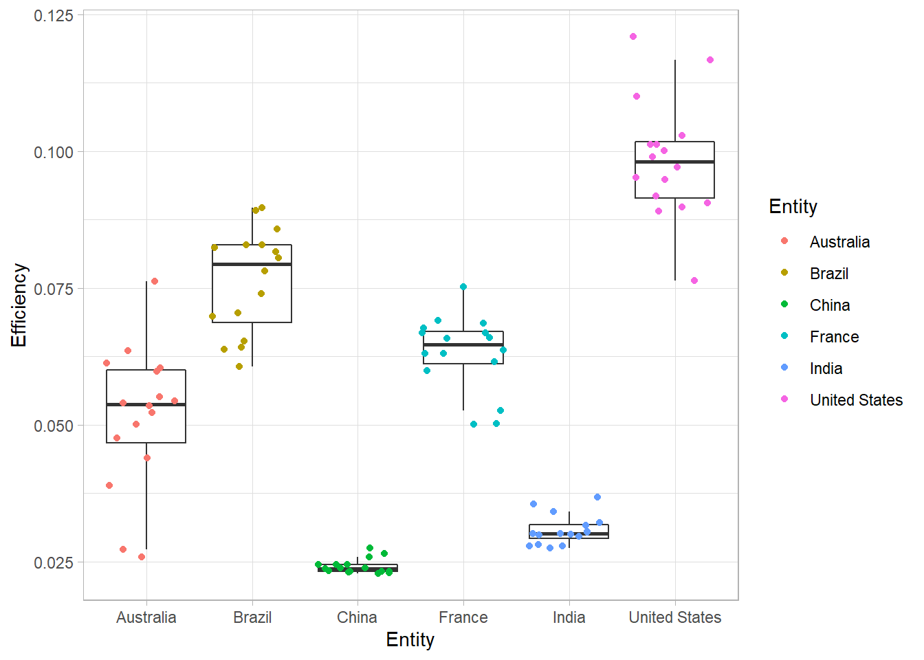
Once again, if you want to know more about raincloud plots, which combine boxplots, points and distribution curves, you can read this post from Cédric Scherer who explains how to make this kind of graph with {ggplot2}.
For now, let’s finish our plot with some customizations:
third <- third+
  labs(
    title="Comparison of nitrogen use efficiency (NUE)",
    subtitle="Each dot represents one year, from 2002 to 2017",
    caption="Source: Our World in Data",
    x="Country",
    y="NUE (t of cereals per kgN)"
  )+
  guides(
    color=FALSE
  )

third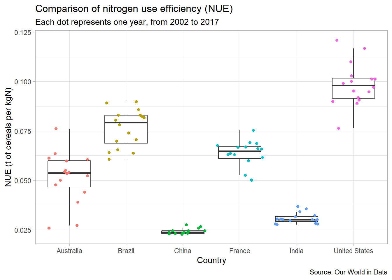
As can be seen on this plot, there is a high variability of nitrogen use efficiency between countries.
In a next post, we will learn how to customize text in {ggplot2}.
3.2. Highlighting one country
Boxplots work well to compare different treatments. But sometimes we just want to highlight the results of one treatment (of one country here). Let’s see how we can do that.
For this example, we will highlight the case of the USA. Let’s create a plot similar to a second plot, including the results for all countries, except the USA.
third_bis<-ggplot(
    data=filter(ferti_clean,Entity!="United States"),  # All countries except USA
    aes(x=Nitrogen,y=Yield)
  )+
  geom_point(color="grey50")+  # Specify color OUTSIDE aes()
  theme_light()

third_bis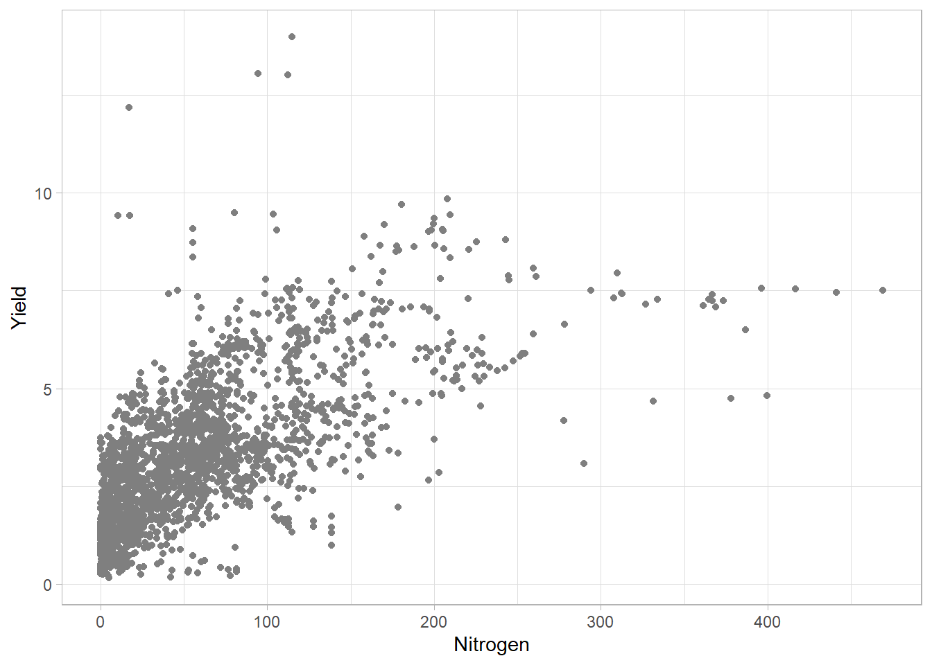
We will now add data for the USA. To do so, we will use another geom_point(), selecting only the USA with the data argument.
third_bis<-third_bis+
  geom_point(
    data=filter(ferti_clean,Entity=="United States"),  # Only USA
    color="dodgerblue",
    size=2.5
  )

third_bis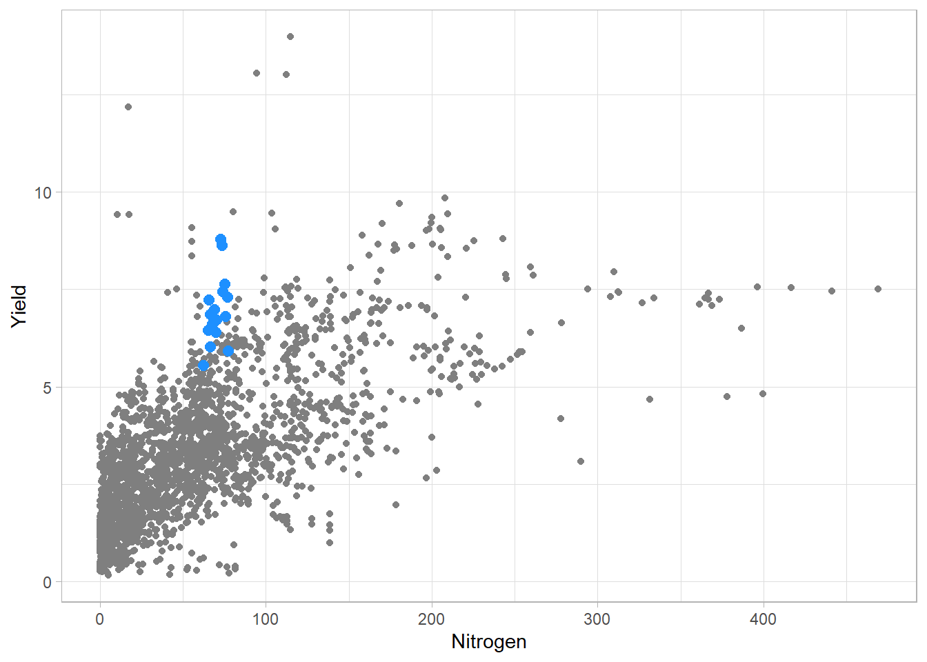
To finish, we may now add some informative texts.
third_bis<-third_bis+
  labs(
    title="NUE for the USA from 2002 to 2017",
    subtitle="Blue dots show data for the USA, grey dots for the rest of the world",
    caption="Source: Our World in Data",
    x="Nitrogen use (kg.ha-1)",
    y="Yield (t.ha-1)"
  )

third_bis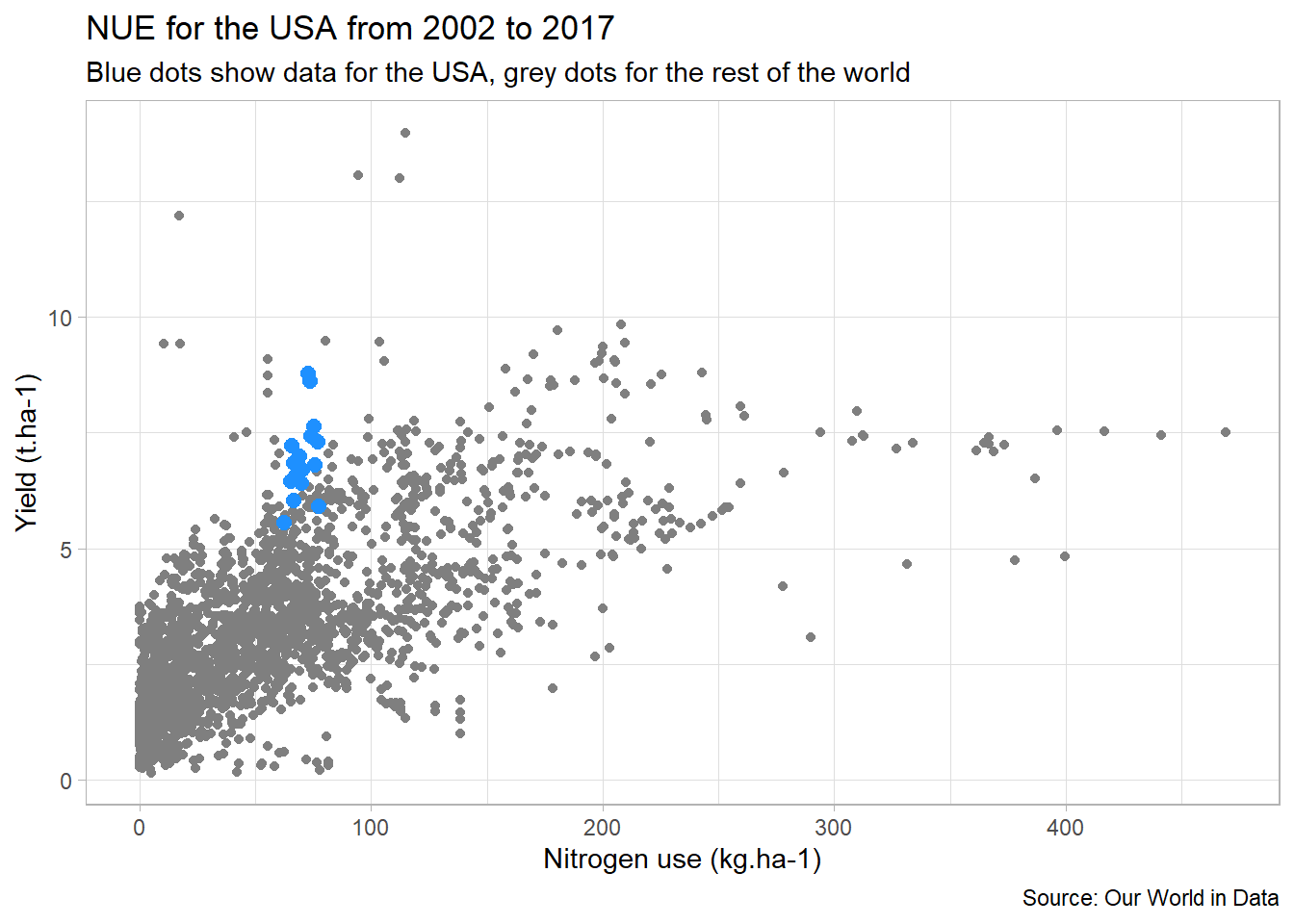
Here we can see that the USA has rather good nitrogen efficiency compared to other countries. From an agronomist point of view, we can think that this is partly due to the importance of corn in this country (less “nitrogen hungry” than wheat for example).
3.3. Animate!
When you have many data to plot, one solution is to animate the results, following the same idea as presented above. You can do so with the {gganimate} extension. Below is one example I made for the #30DayChartChallenge.
Figure 2 Example of animation
I will no detail this plot in this post, but if you’re interested, you may find the script for this plot here.
References
- Mock T. Global Crop Yields (TidyTuesday)
- Ritchie H. and Roser M. Cereal Yields (Our World In Data)
- Scherer C. A ggplot2 Tutorial for Beautiful Plotting in R
- Scherer C. Visualizing Distributions with Raincloud Plots (and How to Create Them with ggplot2)