In the first part) of this tutorial, we created a model that estimates the maximum potential yield of corn based on weather data (temperature and solar radiation). Briefly, this estimation is done in three steps:
1. Estimation of number of leaves (based on daily temperature)
2. Estimation of the amount of photosynthetically active radiation intercepted by the plants
3. Conversion of this amount of radiation into biomass (first plant then grain)
We will now investigate the influence of the different parameters on the model’s results.
We will use the same data as for the first part, as well as the function created to run the model. We won’t go into detail about the data or the creation of this function here, but you must have it loaded in your script to use it (if necessary, you may find the code of this function in the Appendix of the first part).
# Load tidyverse
library(tidyverse)
# Load previous data and function (not shown here)
# Apply function once loaded
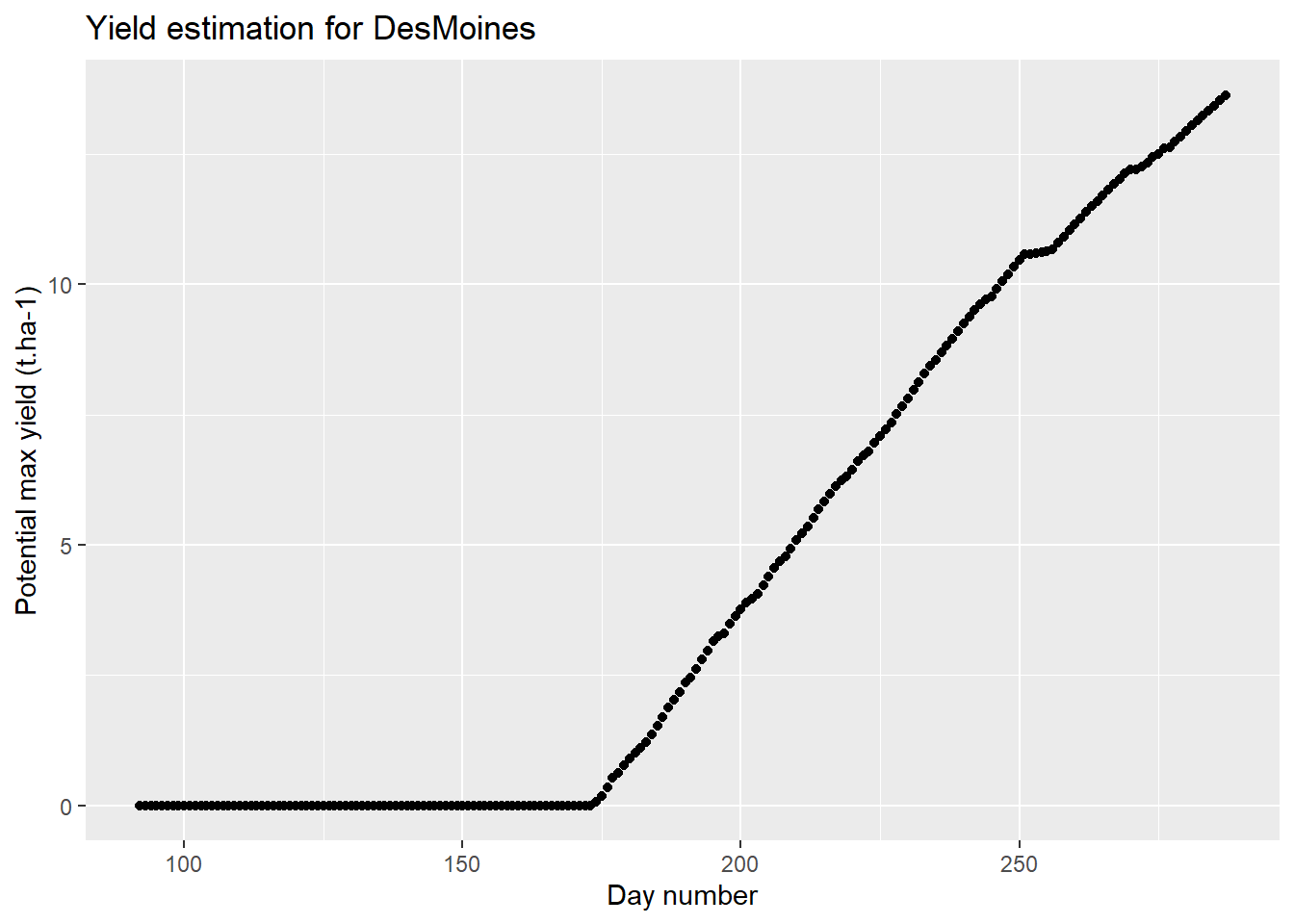
baseline <- model_fun(
name="DesMoines",
data=data,
GDD_1leaf = 50,
C=0.12,
RUE=2,
nthresh = 16
)
# Plotting results
ggplot(data=baseline,aes(x=day_number,y=grain_t))+
geom_point()+
labs(
title = "Yield estimation for DesMoines",
x = "Day number",
y = "Potential max yield (t.ha-1)"
)
1. Sensitivity analysis
A sensitivity analysis is used to determine the effect of uncertainty about the variables or parameters of a model on the final result. Here, we will evaluate the effect of two parameters: \(C\), which reflects the crops’s capacity to intercept light and the Radiation Use Efficieny (\(RUE\), in gDM.MJ-1), which estimates the conversion of the intercepted radiation into biomass.
The parameter C can be decomposed in different parameters according to the following equation:
\[ \quad\text{(Eq. 1)}\quad C = k*S_{leaf}*d_{plant} \] where \(k\) is the light extinction coefficient (reflecting light penetration in crop’s foliage), \(S_{leaf}\) is the individual leaf area, and \(d_{plant}\) is the plant density. These three parameters will be evaluated simultaneously by the sensitivity analysis perfomed on \(C\).
1.1. Prepare the inputs
An important part of sensitivity analysis is to determine the boundaries of each parameter, which can be done through a literature review. For this tutorial, we will take the same boundaries as Ringeval et al. (2021): [0.06; 0.18] for \(C\) and [1; 3] for \(RUE\).
We will now create a data frame that will store the different values that these coefficients can take:
input<-data.frame(
    C_draw=seq(0.06,0.18,0.03),  # C varies from 0.06 to 0.18 with a step of 0.03
    RUE_draw=seq(1,3,0.5),       # RUE varies from 1 to 3 with a step of 0.5
    relative_draw=seq(0,1,0.25)  # To compare both variables on the same scale
  )

input
## C_draw RUE_draw relative_draw
## 1 0.06 1.0 0.00
## 2 0.09 1.5 0.25
## 3 0.12 2.0 0.50
## 4 0.15 2.5 0.75
## 5 0.18 3.0 1.001.2. Create a function
To apply our model to each of these cases, we need to create a new function.
First, to simplify the sensitivity analysis, we will limit ourselves to the comparison of the final yield. To do this, we will use the tail() function to extract only the last value.
output<-model_fun(
  name="DesMoines",
  data=data,
  GDD_1leaf = 50,
  C=0.12,
  RUE=2,
  nthresh = 16
  )%>%
  select(grain_t)%>%        # Select only yield values
  tail(1)                   # Select only the last row
output
## grain_t
## 196 13.63428We will now create a new function that performs this extraction by taking as arguments our two variables of interest \(C\) and \(RUE\):
# Function creation
sensitivity_fun<-function(C_vec,RUE_vec){
  output<-model_fun(
    name="DesMoines",
    data=data,
    GDD_1leaf = 50,
    C=C_vec,
    RUE=RUE_vec,
    nthresh = 16
    )%>%
    select(grain_t)%>%        # Select only yield values
    tail(1)
  return(as.numeric(output))  # Specify that you want numeric output
}
# "Manual" analysis with different values:
sensitivity_fun(C_vec=0.12,RUE_vec=2)
## [1] 13.634281.3. Perform the sensitivity analysis
We are now going to apply this function to the input data frame that we have prepared before. To do so, we will use the mapply() function, that allows to iterate the same function over a vector without the need of using the for loop, that is known to be slow in R. Compared to sapply(), which can perform the same task, mapply can take several arguments. The structure of the function is: mapply(FunctionName, Argument1, Argument2…).
A sensitivity analysis is conducted by varying each parameter independently. We will start with C:
sensitivity<-input%>%
  # "Pipe" our function to the input data frame:
  mutate(
    C_analysis=mapply(
      sensitivity_fun,     # Name of the function
      C_vec=C_draw,        # Argument 1: C (varies)
      RUE_vec=2            # Argument 2: RUE (does not vary yet)
    )
  )

# Plot results
ggplot(sensitivity,aes(x=C_draw,y=C_analysis))+
  geom_line()+
    labs(
    title = "Sensitivity analysis: C",
    x = "C",
    y = "Potential max yield (t.ha-1)"
  )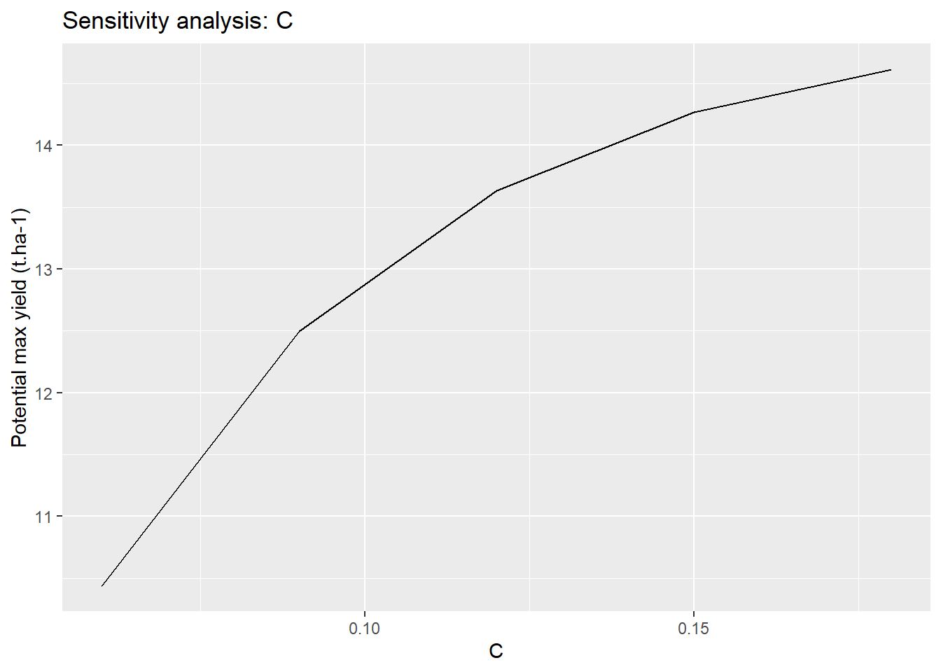
We have thus shown the range of variation of the final yield which depends on the choice of C.
Application Perform the sensitivity analysis for RUE putting the result in a new column of the data frame and compare the two parameters.
sensitivity<-input%>%
  mutate(
    C_analysis=mapply(sensitivity_fun,RUE_vec=2,C_vec=C_draw)
  )%>%
  mutate(
    RUE_analysis=mapply(sensitivity_fun,RUE_vec=RUE_draw,C_vec=0.12)
  )

ggplot(sensitivity)+
  geom_line(aes(x=relative_draw,y=C_analysis),col="blue")+
  geom_line(aes(x=relative_draw,y=RUE_analysis),col="red")+
    labs(                                  # Customize labels
    title = "Sensitivity analysis: C (blue) and RUE (red)",
    x = "Parameters variation (relative scale)",
    y = "Potential max yield (t.ha-1)"
  )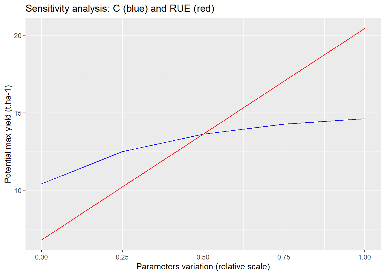
According to the first results of this sensitivity analysis, it seems that the conversion of solar radiation to biomass influences the results more than the interception stage.
2. Uncertainty analysis
As sensitivity analysis, the uncertainty analysis is used to determine the effect of uncertainty about the variables or parameters of a model on the final result but here we consider simultaneously the variability of all parameters. Thus, rather than prioritizing the influence of the different parameters, the uncertainty analysis seeks to evaluate the accuracy of the model result.
As for the sensitivity analysis, we will only focus on \(C\) and \(RUE\) here.
2.1. Prepare the inputs
For the uncertainty analysis, the parameters C and RUE vary simultaneously, so we will create pairs of random values for these two parameters. To do so, we will use the runif() function, wich assumes a uniform distribution on the interval from mininum to maximum.
N=100                       # Number of draws

input<-data.frame(
  C_draw=runif(
    N,                      # Set number of draws
    0.06,                   # Min value
    0.18                    # Max value
  ),
  RUE_draw=runif(
    N,1,3
  )
)

head(input)
## C_draw RUE_draw
## 1 0.14340514 2.323569
## 2 0.06590628 1.098274
## 3 0.13750936 1.255162
## 4 0.09232230 2.084735
## 5 0.15833403 2.348118
## 6 0.14524278 1.2060012.2. Create a function
No need to create a new function here, we will use the same function we created for the sensitivity analysis.
2.3. Perform the uncertainty analysis
We will also use mapply() to apply our function to our different combination of values of {\(C\); \(RUE\)}.
uncertainty<-input %>%
  mutate(
    uncertainty=mapply(sensitivity_fun,RUE_vec=RUE_draw,C_vec=C_draw)
  )

ggplot(uncertainty,aes(y=uncertainty))+
  geom_boxplot()+                           # Use boxplot to plot the results
  labs(
    title="Uncertainty analysis",
    y="Potential max yield (t.ha-1)"
  )+
  theme(                                    # Customize plot rendering
    axis.text.x=element_blank(),            # Hide x-axis labels
    axis.ticks.x=element_blank()            # Hide x-axis ticks
  )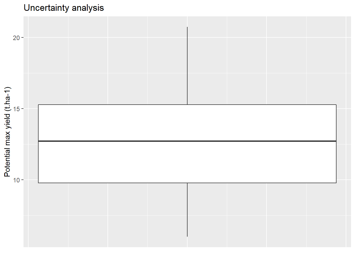
We see that the uncertainty related to the estimation of the final yield is high. This uncertainty can be reduced by optimizing the model, as we will do in the third part of this tutorial.
Reference
- Ringeval, B. et al. (2021). Potential yield simulated by global gridded crop models: using a process-based emulator to explain their differences. Geosci. Model Dev., 14, 1639–1656. https://doi.org/10.5194/gmd-14-1639-2021