Polar barplots can be an alternative to standard barplots but several steps are required to obtain a nice layout. The R Graph Gallery by Yan Holtz has a comprehensive tutorial for this. We will see how this tutorial can be adapted and applied to a specific dataset.
1. Get the data
For this example, we will use the data of week 36 (year 2021) of Tidy Tuesday, about bird baths (Cleary et al., 2016).
# Load data
birds<- readr::read_csv('https://raw.githubusercontent.com/rfordatascience/tidytuesday/master/data/2021/2021-08-31/bird_baths.csv')

head(birds)
## # A tibble: 6 x 5
## survey_year urban_rural bioregions bird_type bird_count
## <dbl> <chr> <chr> <chr> <dbl>
## 1 2014 Urban South Eastern Queens~ Bassian Thrush 0
## 2 2014 Urban South Eastern Queens~ Chestnut-breasted Ma~ 0
## 3 2014 Urban South Eastern Queens~ Wild Duck 0
## 4 2014 Urban South Eastern Queens~ Willie Wagtail 0
## 5 2014 Urban South Eastern Queens~ Regent Bowerbird 0
## 6 2014 Urban South Eastern Queens~ Rufous Fantail 02. Polar barplot with one variable
First, we will produce a barplot with a single variable: number of sights for the 10 most common bird species in Australia. Let’s start by extracting the data for the ten most common species.
library(tidyverse)

one<-birds%>%
  group_by(bird_type)%>%
  summarise(tot=sum(bird_count))%>%
  arrange(tot)%>%      # Sort by total number of sights
  tail(10)%>%          # Select only last 10 rows
  ungroup()

one
## # A tibble: 10 x 2
## bird_type tot
## <chr> <dbl>
## 1 Spotted Dove 302
## 2 Eastern Spinebill 306
## 3 Crimson Rosella 310
## 4 Pied Currawong 314
## 5 Magpie-lark 320
## 6 Superb Fairy-wren 340
## 7 Red Wattlebird 342
## 8 Rainbow Lorikeet 470
## 9 Australian Magpie 524
## 10 Noisy Miner 584We are now ready to make a “standard” barplot.
p1<-ggplot()+
  geom_bar(
    data=one,
    aes(x=fct_reorder(bird_type,tot), y=tot),
    stat="identity",fill="indianred")+
  theme_minimal()

p1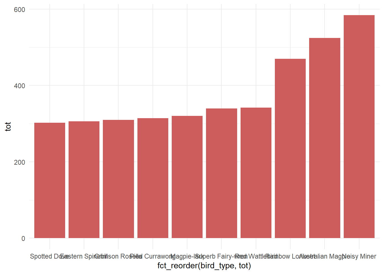
To convert cartesian coordinates to polar coordinates, we use coord_polar() (you may find here another tutorial on how to convert cartesian coordinates to ternary diagrams with coord_tern()).
p1<-p1+
  coord_polar(start=0)

p1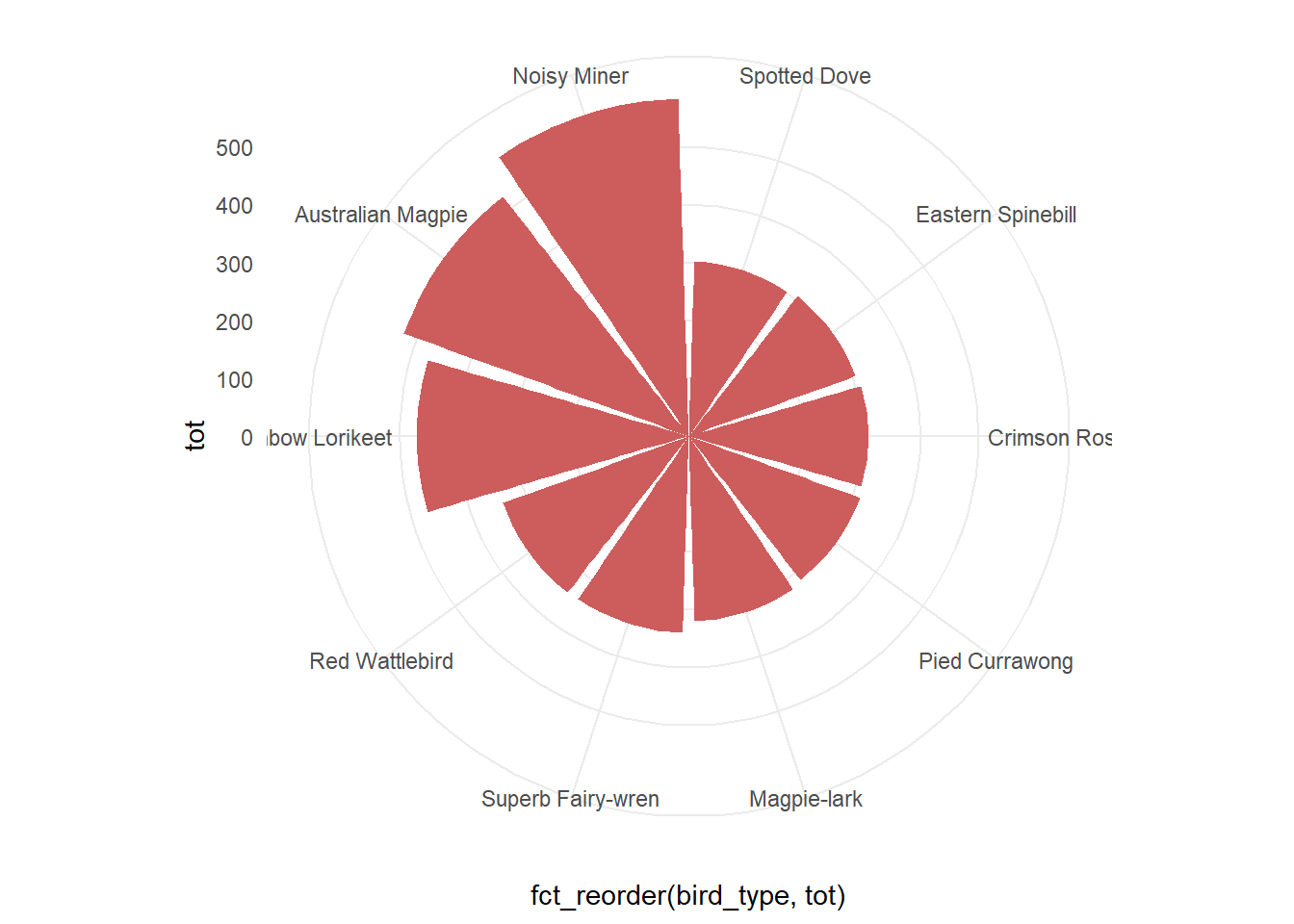
We quickly obtain a circular barplot, but its layout could be improved. We will now customize this plot. First, let’s add some space before the first element. To do so, we will create some blank lines in our dataset.
one<-one %>%
  add_row(
    tot=c(0,0),  # Two blank lines with 0 bird sights
    .before = 1  # Add at the beginning of the data frame
  )%>%
  # Create new column based on row numbers
  # that will be used as x-axis
  mutate(
    id = row_number()
  )
We may now create a new polar barplot.
p1_bis<-ggplot()+
  geom_bar(
    data=one,
    aes(x=id, y=tot),   # Use id as x-axis
    stat="identity",fill="indianred")+
  # Add space in/out the circle
  ylim(
    -max(one$tot)/2,
    max(one$tot)*1.5
  )+
  coord_polar(start=0)+
  theme_minimal()+
  # Hide former theme elements
  theme(
    axis.text = element_blank(),
    axis.title = element_blank(),
    panel.grid = element_blank()
  )

p1_bis
We will now replace the previous labels with a legend more appropriate to the new layout. The most clever part of the tutorial of the R Graph Gallery is how to add labels to polar barplots.
To do so, we will add a new column, angle, to our data frame to specify the angles of the labels. The main idea is that the first item (North) must have a 90 degrees angle. This angle will then decrease clockwise (0 in the East for example).
one<-one%>%
  mutate(
    # Use (id-0.5), not just id, to center label on each item
    angle=90-360*(id-0.5)/max(id)
  )

one
## # A tibble: 12 x 4
## bird_type tot id angle
## <chr> <dbl> <int> <dbl>
## 1 <NA> 0 1 75
## 2 <NA> 0 2 45
## 3 Spotted Dove 302 3 15
## 4 Eastern Spinebill 306 4 -15
## 5 Crimson Rosella 310 5 -45
## 6 Pied Currawong 314 6 -75
## 7 Magpie-lark 320 7 -105
## 8 Superb Fairy-wren 340 8 -135
## 9 Red Wattlebird 342 9 -165
## 10 Rainbow Lorikeet 470 10 -195
## 11 Australian Magpie 524 11 -225
## 12 Noisy Miner 584 12 -255We may now add the labels on the plot with geom_text().
p1_bis+
  geom_text(
    data=one,
    aes(x=id,y=tot+5,label=bird_type,angle=angle),
    hjust=0     # Left align
  )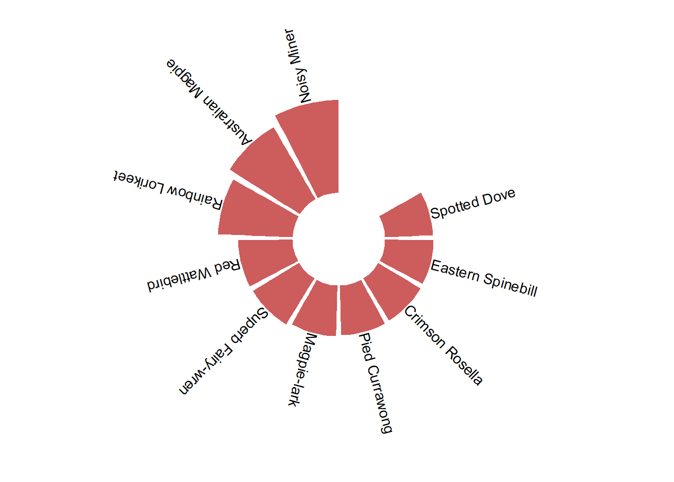
This works well for the right part of the graph, but some modifications are still required for the left part. To make these labels more readable, we will flip them by 180 degrees. But this also implies to modify the adjustment of the text, so that the labels are well directed towards the outside of the graph. We will specify this by adding a new column: hjust.
one<-one%>%
  # Right align on the left,
  # left align on the right
  mutate(
    hjust=case_when(
      angle<=-90~1,
      TRUE~0
    )
  )%>%
  # Flip left side labels
  mutate(
    angle=case_when(
      angle<=-90~angle+180,
      TRUE~angle
    )
  )

one
## # A tibble: 12 x 5
## bird_type tot id angle hjust
## <chr> <dbl> <int> <dbl> <dbl>
## 1 <NA> 0 1 75 0
## 2 <NA> 0 2 45 0
## 3 Spotted Dove 302 3 15 0
## 4 Eastern Spinebill 306 4 -15 0
## 5 Crimson Rosella 310 5 -45 0
## 6 Pied Currawong 314 6 -75 0
## 7 Magpie-lark 320 7 75 1
## 8 Superb Fairy-wren 340 8 45 1
## 9 Red Wattlebird 342 9 15 1
## 10 Rainbow Lorikeet 470 10 -15 1
## 11 Australian Magpie 524 11 -45 1
## 12 Noisy Miner 584 12 -75 1p1_bis<-p1_bis+
geom_text(
data=one,
aes(x=id,y=tot+10,label=bird_type,angle=angle,hjust=hjust),
size=2.5
)
p1_bis
We also have to add the y-axis manually.
grid_manual <- data.frame(
  x = c(1.5,1.5),
  xend = c(2.4,2.4),
  y = c(200,400)

)

p1_bis<-p1_bis+
  geom_segment(
    data=grid_manual,
    aes(x=x,xend=xend,y=y,yend=y),
    col="grey50"
  )+
  geom_text(
    data=grid_manual,
    aes(x=1,y=y,label=y),
    size=2.5,col="grey50",
    hjust=0
  )+
  annotate(
    geom='text',
    x=1,y=600,
    label="Number of sights",
    size=2.5,col="grey50",
    hjust=0
  )

p1_bis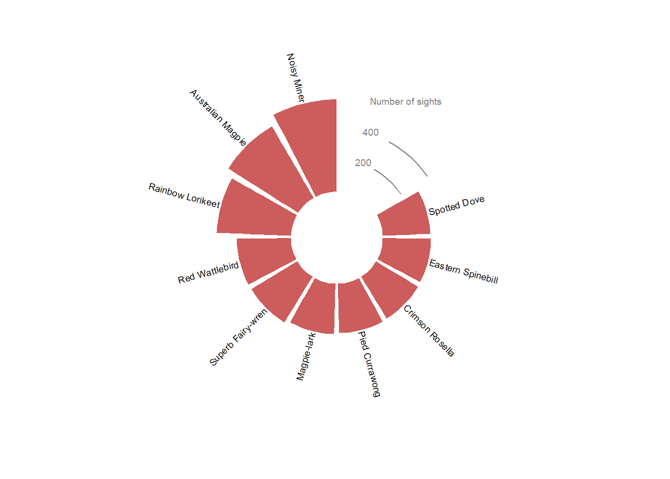
We can now finish this graphic by adding a title with the {cowplot} extension.
library(cowplot)

ggdraw() +
  draw_plot(p1_bis, x = 0, y = 0, width = 1, height = 1)+
  draw_text(
    text = "Ten most common\nbird species in Australia",
    size = 13,
    hjust=0,color="#343a40",
    x = 0.5, y = 0.9)
3. Polar barplot with two variables
The dataset also contains information about the type of landscape where the birds were sighted (urban or rural). We will now add this information on the polar barplot. We will start by creating a data frame with the number of sights per bird types and per landscape for the 10 most common bird species.
# Get the name of the 10 most common birds
top <- birds%>%
  group_by(bird_type)%>%
  summarise(tot=sum(bird_count))%>%
  arrange(tot)%>%
  tail(10)%>%
  pull(bird_type)

# Data frame with number of sights per bird type AND landscape
two <- birds%>%
  filter(bird_type %in% top)%>%
  group_by(bird_type,urban_rural)%>%
  summarise(tot_cat=sum(bird_count))%>%
  ungroup()%>%
  # Change name of NA to 'Unknown'
  mutate(urban_rural=case_when(
    is.na(urban_rural)~'Unknown',
    TRUE~urban_rural
  ))

two
## # A tibble: 30 x 3
## bird_type urban_rural tot_cat
## <chr> <chr> <dbl>
## 1 Australian Magpie Rural 76
## 2 Australian Magpie Urban 186
## 3 Australian Magpie Unknown 262
## 4 Crimson Rosella Rural 66
## 5 Crimson Rosella Urban 89
## 6 Crimson Rosella Unknown 155
## 7 Eastern Spinebill Rural 87
## 8 Eastern Spinebill Urban 66
## 9 Eastern Spinebill Unknown 153
## 10 Magpie-lark Rural 33
## # ... with 20 more rowsThen we will use the previously created data frame (named one) to specify the position and text adjustment of the labels, merging it with our new data frame (named two).
two<-two%>%
  left_join(one, by="bird_type")%>%
  # Add two empty rows at the beginning of the data frame
  add_row(
    tot_cat=c(0,0),
    id=c(1,2),       # Specify id
    .before = 1
  )

two
## # A tibble: 32 x 7
## bird_type urban_rural tot_cat tot id angle hjust
## <chr> <chr> <dbl> <dbl> <dbl> <dbl> <dbl>
## 1 <NA> <NA> 0 NA 1 NA NA
## 2 <NA> <NA> 0 NA 2 NA NA
## 3 Australian Magpie Rural 76 524 11 -45 1
## 4 Australian Magpie Urban 186 524 11 -45 1
## 5 Australian Magpie Unknown 262 524 11 -45 1
## 6 Crimson Rosella Rural 66 310 5 -45 0
## 7 Crimson Rosella Urban 89 310 5 -45 0
## 8 Crimson Rosella Unknown 155 310 5 -45 0
## 9 Eastern Spinebill Rural 87 306 4 -15 0
## 10 Eastern Spinebill Urban 66 306 4 -15 0
## # ... with 22 more rowsWe are now ready to make the plot.
p2<-ggplot()+
  # Polar barplot, with fill attribute in aes()
  geom_bar(
    data=two,
    aes(x=id, y=tot_cat, fill=urban_rural),
    stat="identity")+
  ylim(
    -max(one$tot)/2,
    max(one$tot)*1.5
  )+
  coord_polar(start=0)+

  # Specify fill values
  scale_fill_manual(values=c("indianred4","indianred2","rosybrown3"))+
  guides(fill=FALSE)+

  # Hide theme elements
  theme_minimal()+
  theme(
    axis.text = element_blank(),
    axis.title = element_blank(),
    panel.grid = element_blank()
  )+

  # Create new legend
  # Select only one category (Urban for example) for bird lables
  geom_text(
    data=filter(two,urban_rural=="Urban"),
    aes(x=id,y=tot+10,label=bird_type,angle=angle,hjust=hjust),
    size=2.5
  )+
  # Add landscape legend
  annotate(
    geom='text',x=0.5,y=560,
    label="Rural",size=2.5,col="indianred4",
    hjust=0
  )+
  annotate(
    geom='text',x=0.5,y=400,
    label="Urban",size=2.5,col="indianred2",
    hjust=0
  )+
  annotate(
    geom='text',x=0.5,y=150,
    label="Unknown",size=2.5,col="rosybrown3",
    hjust=0
  )+
  # Add y-axis
  geom_segment(
    data=grid_manual,
    aes(x=2,xend=2.4,y=y,yend=y),
    col="grey50"
  )+
  geom_text(
    data=grid_manual,
    aes(x=1.5,y=y,label=y),
    size=2.5,col="grey50",
    hjust=0
  )+
  annotate(
    geom='text',
    x=1.5,y=600,
    label="Number of sights",
    size=2.5,col="grey50",
    hjust=0
  )

ggdraw() +
  draw_plot(p2, x = 0, y = 0, width = 1, height = 1)+
  draw_text(
    text = "Ten most common\nbird species in Australia",
    size = 13,
    hjust=0,color="#343a40",
    x = 0.5, y = 0.9)
4. More customization
We will not go into details here but you may manually add subcategories on the inner circle. You may also use other arguments of the aes() to add more informations on the plot. In the example below, I used color for bird species and alpha for landscape (urban or rural). The code for this plot is available here.
References
- Cleary G.P. et al., 2016 Avian Assemblages at Bird Baths: A Comparison of Urban and Rural Bird Baths in Australia
- Holtz Y., Circular barplot