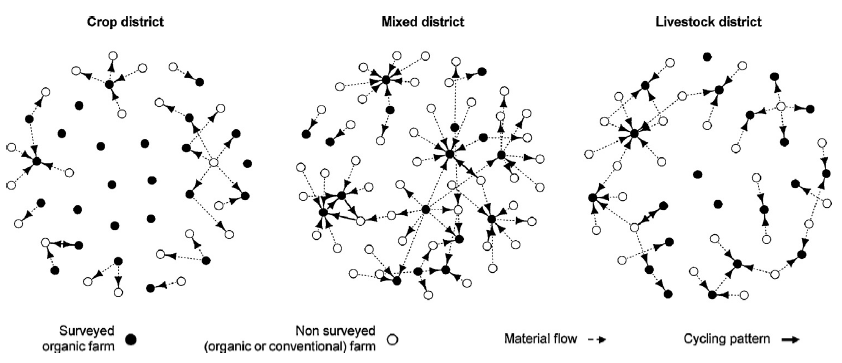
A few years ago we published an article assessing nutrient recycling between farms in different territories. This evaluation was based on network analysis of material exchanges between farms. On the plot below, each dot (node in network analysis) is a farm and the arrows (edges) show material exchanges, such as manure, straw…, between these farms.
This analysis was then performed with {igraph}. Today, the {tidygraph} package created by Thomas Lin Pedersen allows to use the tidyverse extensions to perform network analysis. In this tutorial, we will see how we can produce and analyze a network of co-authorship of scientific paper, using the TidyTuesday dataset about papers of the National Bureau of Economic Research.
1. Plotting the graph
library(tidyverse)
# Load data
papers <- readr::read_csv('https://raw.githubusercontent.com/rfordatascience/tidytuesday/master/data/2021/2021-09-28/papers.csv')
authors <- readr::read_csv('https://raw.githubusercontent.com/rfordatascience/tidytuesday/master/data/2021/2021-09-28/authors.csv')
paper_authors <- readr::read_csv('https://raw.githubusercontent.com/rfordatascience/tidytuesday/master/data/2021/2021-09-28/paper_authors.csv')

head(paper_authors)
## # A tibble: 6 x 2
## paper author
## <chr> <chr>
## 1 w0001 w0001.1
## 2 w0002 w0002.1
## 3 w0003 w0003.1
## 4 w0004 w0004.1
## 5 w0005 w0005.1
## 6 w0006 w0006.1We could create a co-authorship network straight from the paper_authors table that makes the link between the papers and their authors. However, it is a large data table:
dim(paper_authors)## [1] 67090 2Network analysis on this type of data can be tedious, and requires some computing power. To make things easier, we will work on a subset: papers published in 1995.
paper_authors_95<-paper_authors%>%
  # Merge paper table to get year of publication
  left_join(papers)%>%
  # Filter by year
  filter(year==1995)

head(paper_authors_95)
## # A tibble: 6 x 5
## paper author year month title
## <chr> <chr> <dbl> <dbl> <chr>
## 1 w4758 w0388.2 1995 3 Bilateralism and Regionalism in Japanese and U.S. T~
## 2 w4758 w4758.1 1995 3 Bilateralism and Regionalism in Japanese and U.S. T~
## 3 w4982 w2677.2 1995 1 Explaining Forward Exchange Bias..Intraday
## 4 w4982 w3385.1 1995 1 Explaining Forward Exchange Bias..Intraday
## 5 w4983 w0164.1 1995 1 Implementing Free Trade Areas: Rules of Origin and ~
## 6 w4983 w1535.1 1995 1 Implementing Free Trade Areas: Rules of Origin and ~For this subset, we must now create a table summarizing the connections between the different authors, based on co-published articles. This part is a bit technical as we want (i) to keep authors with only single authored papers, in order to highlight nodes with no connection in the network and (ii) to avoid double counting of collaborations between two authors.
To facilitate author sorting in the next step, we will start by creating a new variable converting author references into integers.
# Transform author references to integer
edges_list <- paper_authors_95 %>%
  mutate(author_id = as.integer(as.factor(author)))
We are now ready to create a table summarizing all connections between authors:
edges_list <- edges_list %>%
  # Create one row for each collaboration between 2 authors
  left_join(edges_list, by='paper') %>%
  # Count number of collaboration for each pair
  count(author_id.x, author_id.y)%>%
  # Create two new variables to identify max and min author for each pair
  mutate(
    max=pmax(author_id.x,author_id.y),
    min=pmin(author_id.x,author_id.y)
  )%>%
  # Combine them in a "check" variable
  unite(check, c(min, max), remove = FALSE) %>%
  # Remove duplicates of the "check" variable
  distinct(check, .keep_all = TRUE) %>%
  # Set n to 0 for single authored papers
  # (this avoid to count them as connection)
  mutate(n=case_when(
    (author_id.x==author_id.y)~as.integer(0),
    TRUE~n)
  )%>%
  # Rename columns
  # ({tidygraph} requires "from" and "to")
  rename(
    from=author_id.x,
    to=author_id.y
  )%>%
  # Select columns of interest
  select(from,to,n)

edges_list
## # A tibble: 982 x 3
## from to n
## <int> <int> <int>
## 1 1 1 0
## 2 1 10 1
## 3 2 2 0
## 4 2 12 2
## 5 3 3 0
## 6 4 4 0
## 7 4 5 1
## 8 5 5 0
## 9 6 6 0
## 10 7 7 0
## # ... with 972 more rowsThis table summarize all the edges of the network. We can now convert this table into a network with the as_tbl_graph() function of the {tidygraph} extension (for this function to work, the input table must have at least two columns identified as “to” and “from”).
library(tidygraph)
network <- as_tbl_graph(edges_list, directed = FALSE)
network
## # A tbl_graph: 535 nodes and 982 edges
## #
## # An undirected multigraph with 191 components
## #
## # Node Data: 535 x 1 (active)
## name
## <chr>
## 1 1
## 2 2
## 3 3
## 4 4
## 5 5
## 6 6
## # ... with 529 more rows
## #
## # Edge Data: 982 x 3
## from to n
## <int> <int> <int>
## 1 1 1 0
## 2 1 10 1
## 3 2 2 0
## # ... with 979 more rowsAs we can see above, the object tbl_graph returned by the as_tbl_graph() function is composed of two tables: one with the nodes of the network and another with the edges. We may now plot this network with {ggraph}:
# Set theme
custom_theme <- theme_minimal() +
  theme(
    axis.title = element_blank(),
    axis.text = element_blank(),
    panel.grid = element_blank(),
    panel.grid.major = element_blank()
  )

library(ggraph)
ggraph(
  # Input data
  graph= network,
  # Algorithms to place points (here Kamada-Kawai)
  layout = "kk") +
  geom_node_point() +
  geom_edge_diagonal(color = "dimgrey", alpha = 0.8)+
  labs(
    title = 'Co-authorship network for year 1995',
    subtitle = 'Algorithm: Kamada-Kawai'
  )+
 custom_theme
Note that the graph of the network is highly dependent on the algorithm selected for the layout. The 13 different layout algorithms for classic node-edge diagrams are referenced here.
Below is the same network, but plotted with another algorithm:
ggraph(
  graph= network,
  layout = "fr") +
  geom_node_point() +
  geom_edge_diagonal(color = "dimgrey", alpha = 0.8)+
  labs(
    title = 'Co-authorship network for year 1995',
    subtitle = 'Algorithm: Fruchterman-Reingold.'
  )+
 custom_theme
2. Speed up the workflow
As seen above, there are multiple steps to convert our data set to a edges list that can be convert to a network with {ggraph}. To speed up the process, we can create a function, specific to this case study, that will create the corresponding network for each year:
fun_net <- function(yr){
# Filter paper by years
paper_authors_year<-paper_authors%>%
left_join(papers)%>%
filter(year==yr)
# Convert author references to integers
edges_list <- paper_authors_year %>%
mutate(author_id = as.integer(as.factor(author)))
# Build edges list
edges_list <- edges_list %>%
left_join(edges_list, by='paper') %>%
count(author_id.x, author_id.y)%>%
mutate(
max=pmax(author_id.x,author_id.y),
min=pmin(author_id.x,author_id.y)
)%>%
unite(check, c(min, max), remove = FALSE) %>%
distinct(check, .keep_all = TRUE) %>%
mutate(n=case_when(
(author_id.x==author_id.y)~as.integer(0),
TRUE~n)
)%>%
rename(
from=author_id.x,
to=author_id.y
)%>%
select(from,to,n)
# Convert to network
network <- as_tbl_graph(edges_list, directed = FALSE)
return(network)
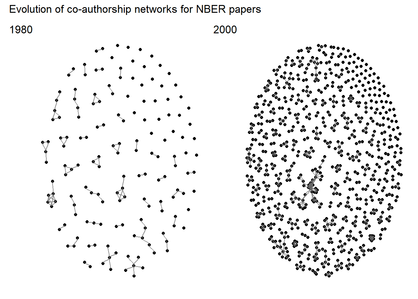
}Using this function, it is easier to compare networks between different years:
# Load patchwork to assemble plots
library(patchwork)

# Create plot for year 1980
p80 <- ggraph(
  graph= fun_net(1980),
  layout = "fr") +
  geom_node_point() +
  geom_edge_diagonal(color = "dimgrey", alpha = 0.8)+
 custom_theme

# Create plot for year 2000
p00 <- ggraph(
  graph= fun_net(2000),
  layout = "fr") +
  geom_node_point() +
  geom_edge_diagonal(color = "dimgrey", alpha = 0.8)+
 custom_theme

# Set layout
layout<-c(
  area(t=1,l=1,b=4,r=2),
  area(t=1,l=3,b=4,r=4)
)
# Assemble plots
p80+p00+
  plot_layout(design=layout)+
  plot_annotation(
    title = "Evolution of co-authorship networks for NBER papers",
    tag_levels = list(c('1980', '2000'))
  )
3. Network metrics
We will now see how we can calculate some metrics for this network.
Let’s start with metrics for the whole network:
net80 <- fun_net(1980)
net00 <- fun_net(2000)

# Load {igraph} to get additional functions
library(igraph)
# Density: Proportion of possible connections that exist
Density<-rbind(
  igraph::edge_density(net80),
  igraph::edge_density(net00)
)
# Diameter: Longest shortest path across network
Diameter<-rbind(
  with_graph(net80, graph_diameter()),
  with_graph(net00, graph_diameter())
)
# Mean distance between two nodes
Distance<-rbind(
  with_graph(net80, graph_mean_dist()),
  with_graph(net00, graph_mean_dist())
)
# Transitivity:  probability for adjacent nodes to be interconnected
Transitivity<-rbind(
  igraph::transitivity(net80),
  igraph::transitivity(net00)
)

tibble(
  Year=rbind(1980,2000),Density,Diameter,Distance,Transitivity
)
## # A tibble: 2 x 5
## Year[,1] Density[,1] Diameter[,1] Distance[,1] Transitivity[,1]
## <dbl> <dbl> <dbl> <dbl> <dbl>
## 1 1980 0.0208 4 1.43 0.589
## 2 2000 0.00490 7 2.51 0.534We can also calculate metrics by node. In network analysis, the most common metric for each node is degree, that is the number of connections for each node. We may compute this value for our networks. As tbl_graph objects are composed of two tables (one for nodes, one for edges), we need to specify the one we want to modify with activate(), as demonstrated below:
# Start with network for year 1980:
net80 <- net80 %>%
  # First activate edges to set weights of each connection
  activate(edges) %>%
  mutate(weights = case_when(
    # Solo-authored set to weight=0
    n==0 ~ 0,
    # Weight = 1 for all others collaborations
    TRUE ~1
  ))%>%
  # Now activate nodes
  activate(nodes)%>%
  # Compute degree for each node
  mutate(deg = centrality_degree(weights = weights))%>%
  # Find author with most collaboration
  # (highest-degree node)
  mutate(max_deg = max(deg))%>%
  mutate(max_author = case_when(
    deg == max_deg ~ 1,
    TRUE ~ 0
  ))

# Same steps for year 2000
net00 <- net00 %>%
  activate(edges) %>%
  mutate(weights = case_when(
    n==0 ~ 0,
    TRUE ~1
  ))%>%
  activate(nodes)%>%
  mutate(deg = centrality_degree(weights = weights))%>%
  mutate(max_deg = max(deg))%>%
  mutate(max_author = case_when(
    deg == max_deg ~ 1,
    TRUE ~ 0
  ))
We may now calculate the average degree for each network.
stat_deg_80 <- net80 %>%
  activate(nodes)%>%
  as_tibble()%>%
  summarise(
    year = '1980',
    mean_deg = mean(deg),
    max_deg = mean(max_deg))

stat_deg_00 <- net00 %>%
  activate(nodes)%>%
  as_tibble()%>%
  summarise(
    year = '2000',
    mean_deg = mean(deg),
    max_deg = mean(max_deg))

bind_rows(stat_deg_80,stat_deg_00)
## # A tibble: 2 x 3
## year mean_deg max_deg
## <chr> <dbl> <dbl>
## 1 1980 1.22 5
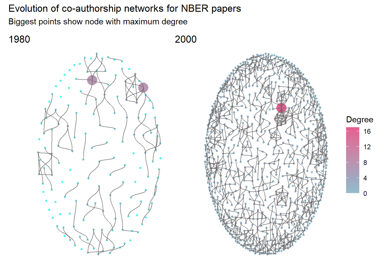
## 2 2000 1.91 17We may see that the number of connection is increasing between 1980 and 2000. For papers published in 2000, each author collaborated on average with approximately two other authors.
We may now add these information to the plots.
p80 <- ggraph(
  net80,
  layout = "kk") +
  # Add
  geom_node_point(aes(col=deg,size=max_author)) +
  scale_color_gradient2(
    low="#58EFEC",mid="#A0A6BE",high="#E85C90",midpoint = 4
  )+
  geom_edge_diagonal(color = "dimgrey", alpha = 0.8)+
  guides(size=FALSE,color=FALSE)+
  custom_theme

# Create plot for year 2000
p00 <- ggraph(
  net00,
  layout = "kk") +
  geom_node_point(aes(col=deg,size=max_author)) +
  scale_color_gradient2(
    low="#58EFEC",mid="#A0A6BE",high="#E85C90",midpoint = 4
  )+
  guides(size=FALSE)+
  labs(color="Degree")+
  geom_edge_diagonal(color = "dimgrey", alpha = 0.8)+
 custom_theme

# Assemble plots
p80+p00+
  plot_layout(
    design=layout,
    guides = "collect")+
  plot_annotation(
    title = "Evolution of co-authorship networks for NBER papers",
    subtitle = "Biggest points show node with maximum degree",
    tag_levels = list(c('1980', '2000'))
  )
More metrics regarding these networks are described in Ben Davies’ blog post .
4. Add more data
Finally, we can use the tidyverse tools to add more data to the network (such as authors’ gender). To do so, we need to activate the nodes table, then join the table with selected features, as performed to create the plot below.

References
Davies B. (2021) Female representation and collaboration at the NBER
Nowak B. et al. Nutrient recycling in organic farming is related to diversity in farm types at the local level
Pedersen TL., Introduction to ggraph: Layouts